20 Two Point Perspective Drawing Ideas of a Kitchen
Oh boy, let me tell you something: if you’ve ever tried to draw a kitchen in two-point perspective, you probably understand the sheer existential dread that comes with getting those lines just right.
It’s like the universe itself is conspiring to make sure your cabinets look like they’re doing the cha-cha instead of hanging straight. I mean, I’m not saying I cried while drawing the countertops that one time, but… let’s just say the paper got a little damp.
But hey, that’s why we’re here, right?
We’re all in this wonky-kitchen-perspective boat together!
I figured if I’m going to keep losing my mind over drawing stoves and fridges that don’t look like they’re about to tip over, I might as well bring you all along for the ride.
So, without further ado, here are some two-point perspective drawing ideas to spice up your sketchbook—because who needs sanity when you’ve got beautifully angled cabinets?
Two Point Perspective Drawing Ideas of a Kitchen
1
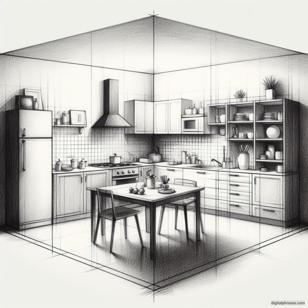
2
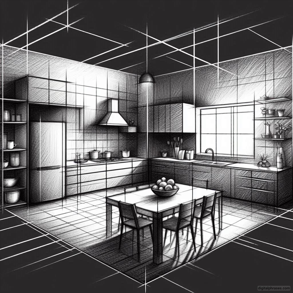
3
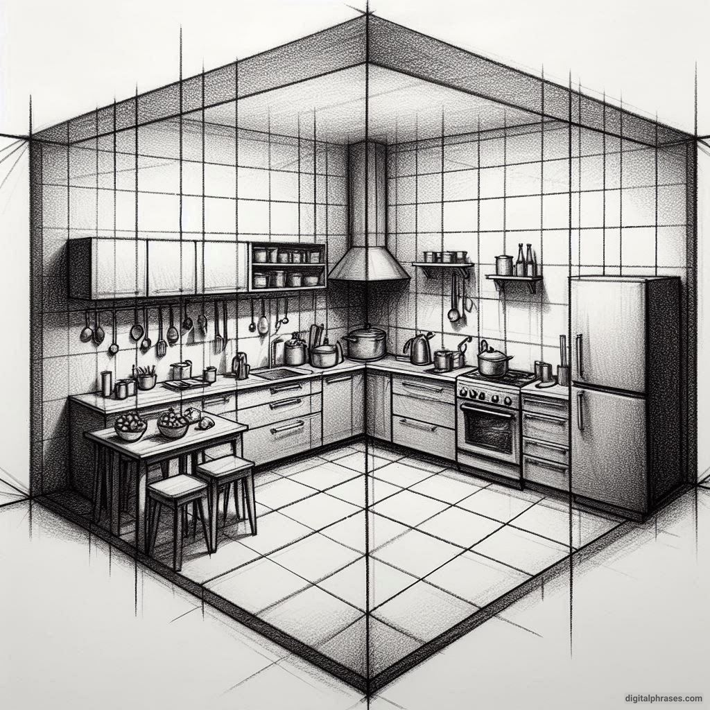
4
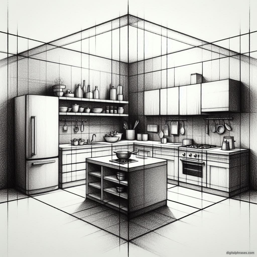
5
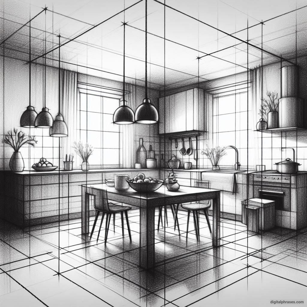
6
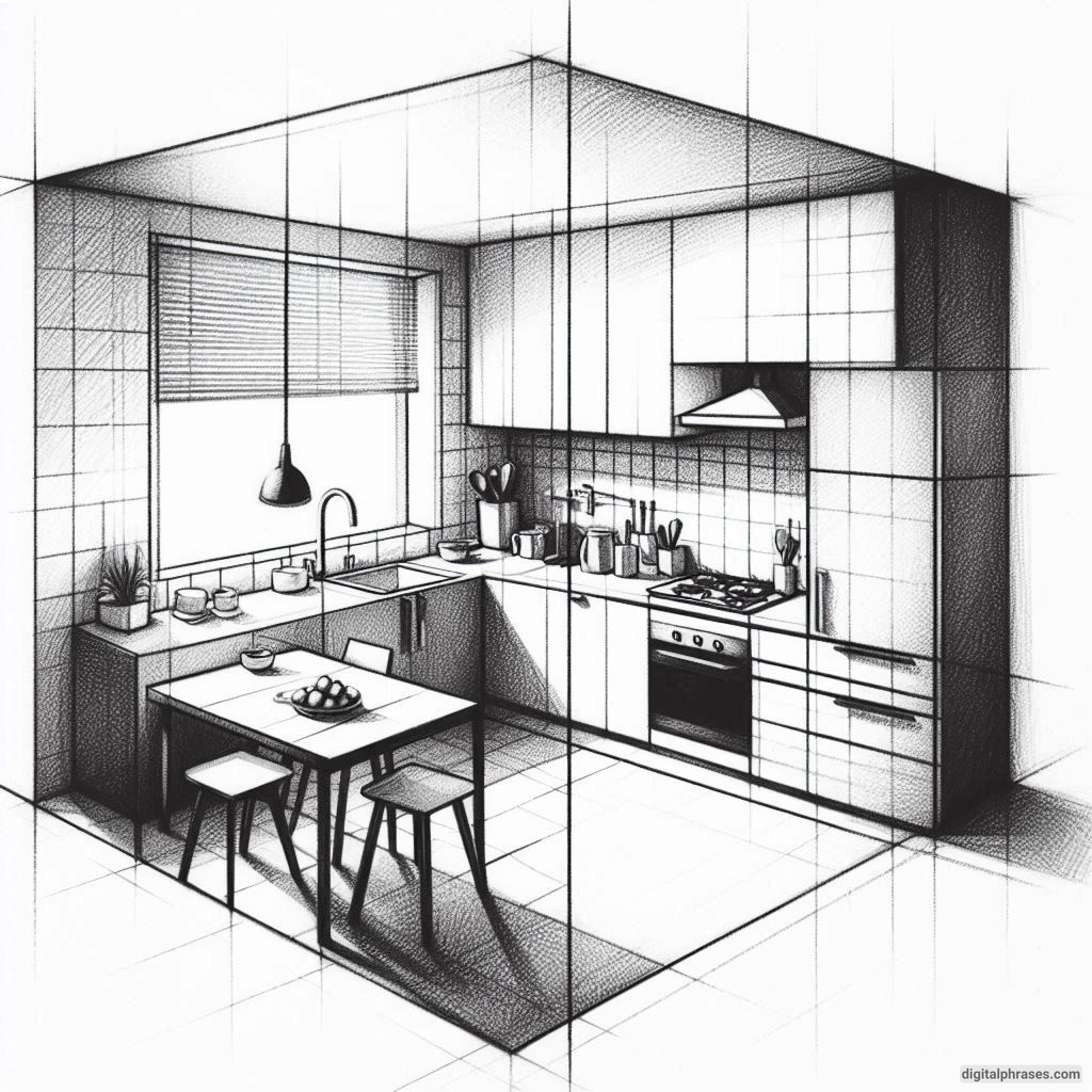
7
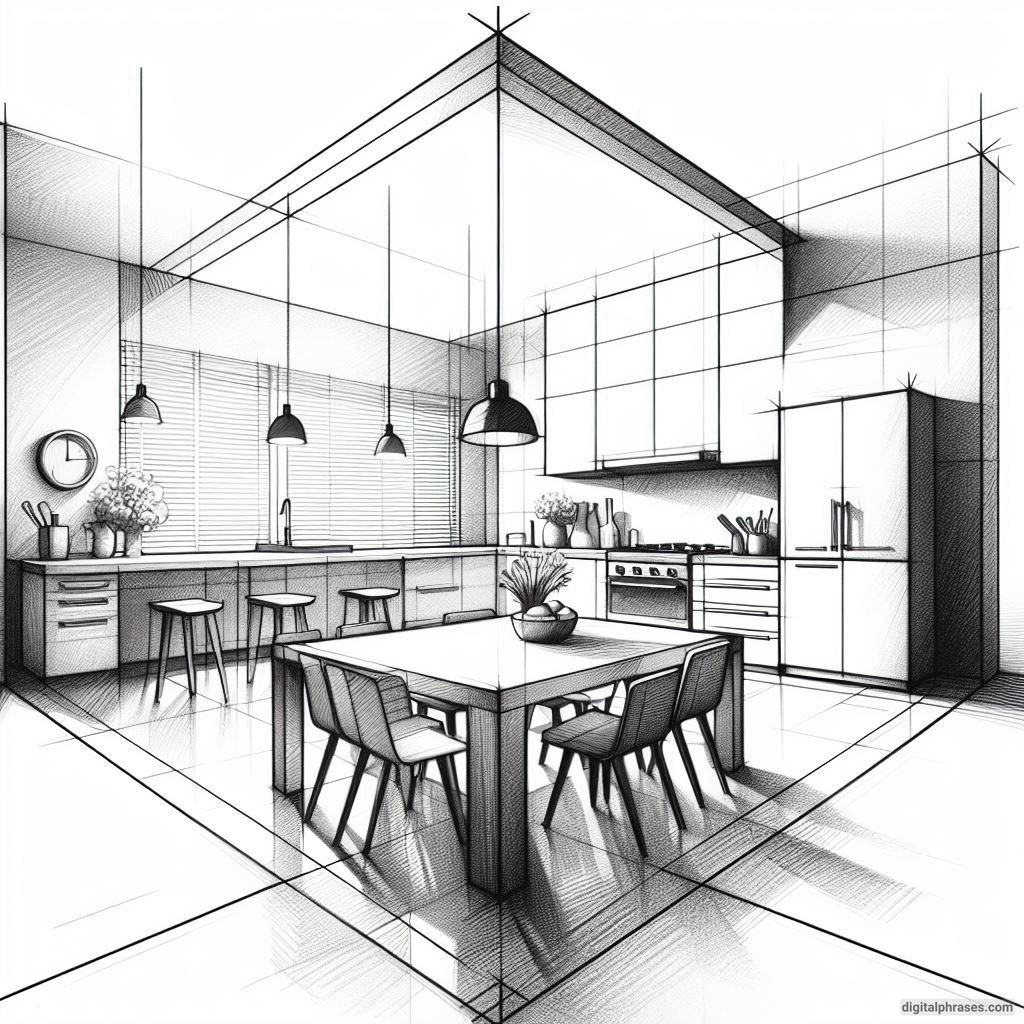
8
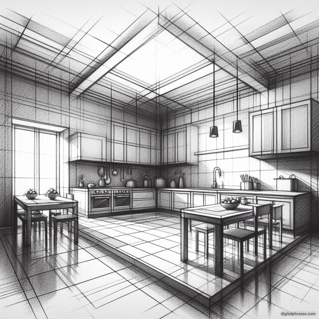
9
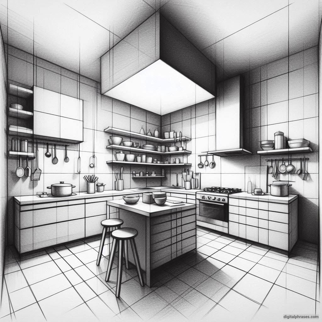
10
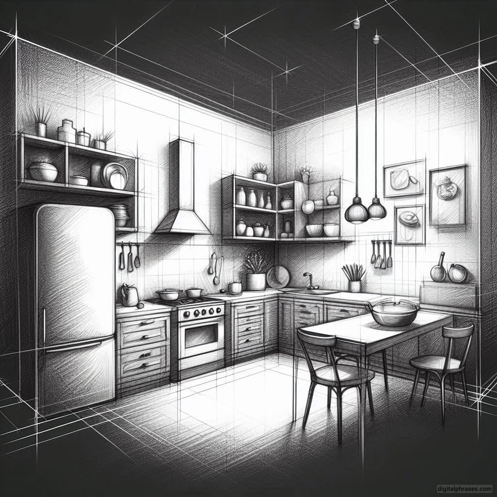
11
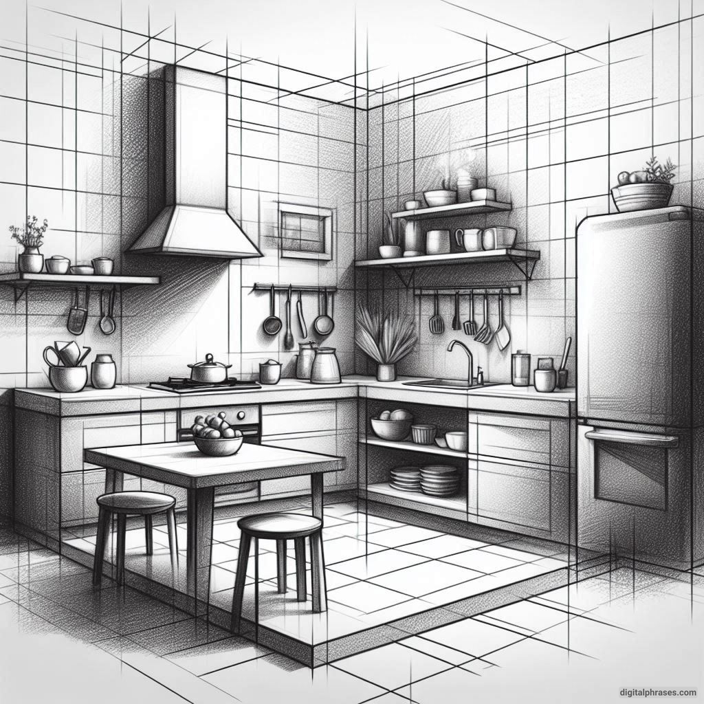
12
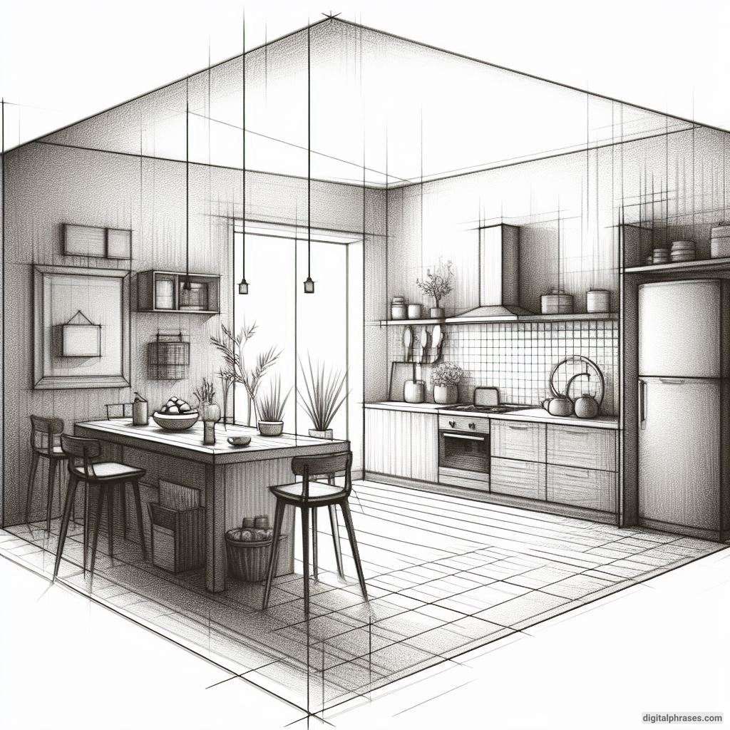
13
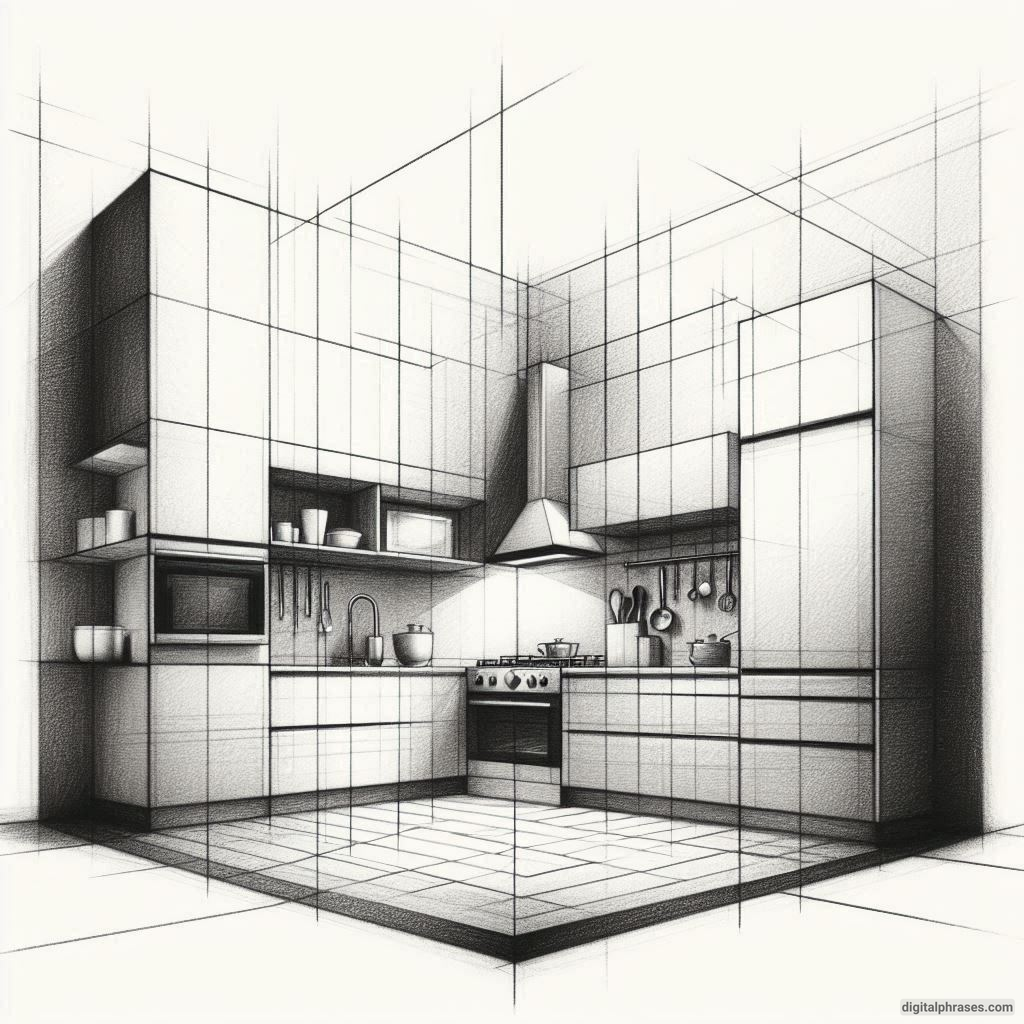
14
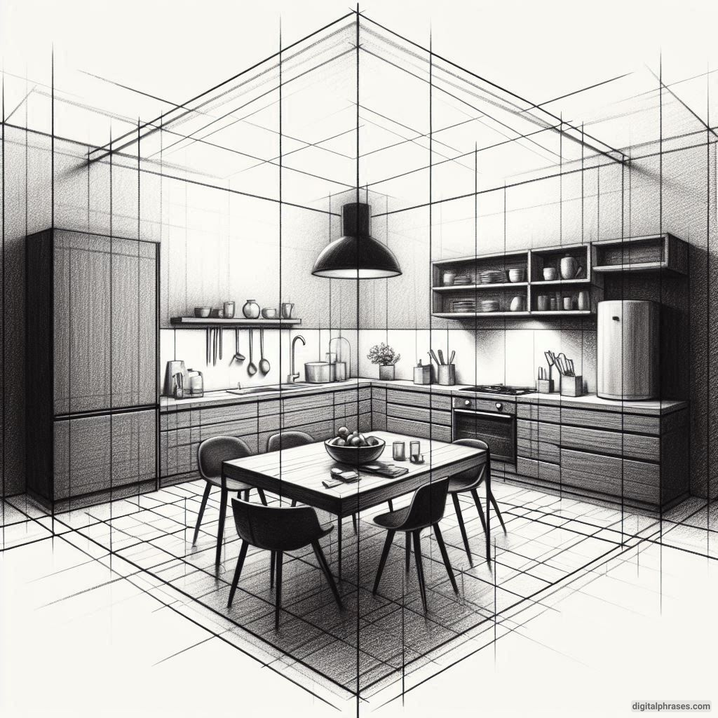
15
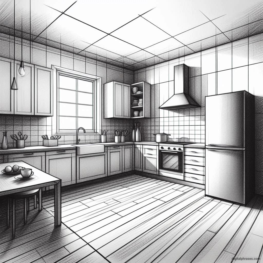
16
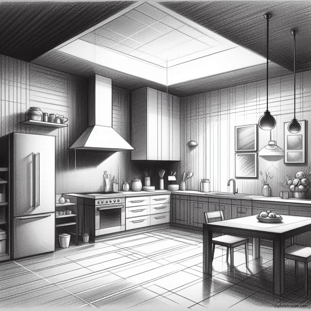
17
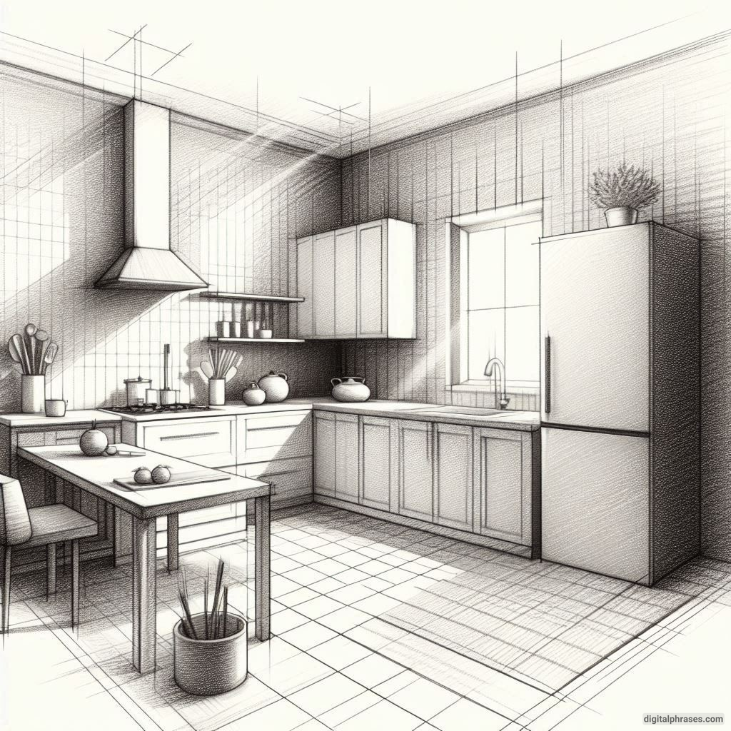
18
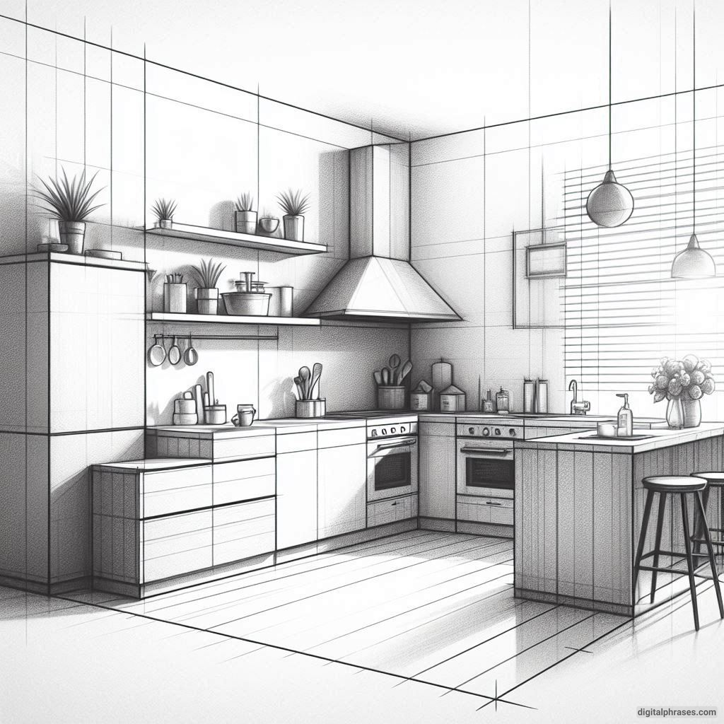
19
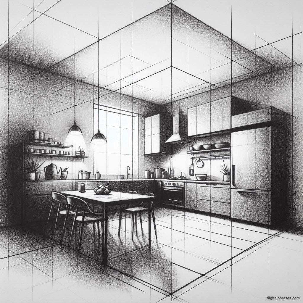
20
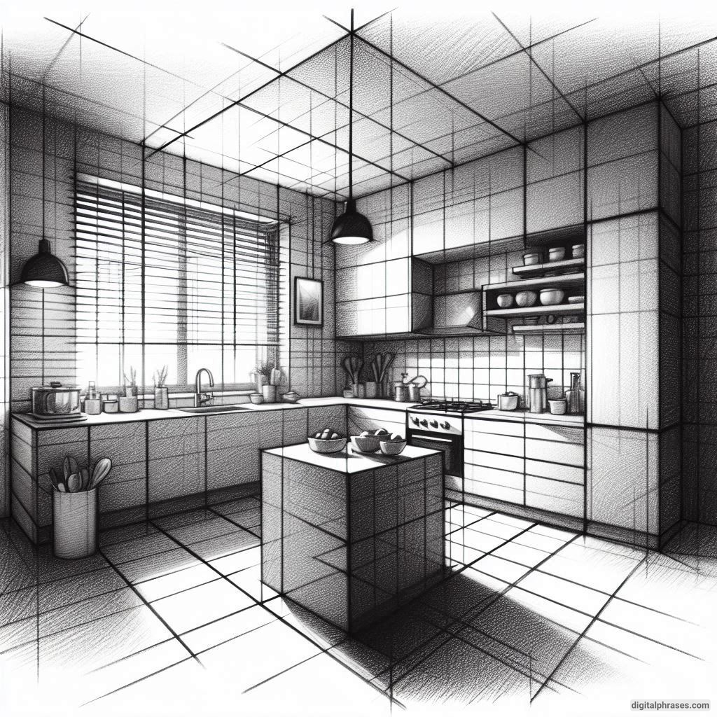
Tips and Tricks for Two-Point Perspective Kitchen Drawings
1. Start with the Horizon Line
Alright, first things first: draw your horizon line. This is where all the magic happens, or where all the confusion starts, depending on your relationship with straight lines. The horizon line is like the GPS of your drawing.
Lose it, and you’ll end up in a place where your kitchen counter is floating in space next to a rogue refrigerator.
Make sure your horizon line is level. Yes, I’m talking to you, my fellow tilted-paper enthusiasts. I once ended up with a kitchen that looked like it was on the side of a cliff. Not a great look unless you’re trying to design for a “gravity-optional” sci-fi movie.
2. Place Your Vanishing Points
For two-point perspective, you need two vanishing points on your horizon line. I suggest putting them far apart, preferably as far as your paper (or wall, or driveway if you’re truly dedicated) will allow. If they’re too close, everything will look like it’s being sucked into a black hole. This is a kitchen, not an interdimensional portal, alright?
Pro tip: Make sure you mark those vanishing points clearly and don’t accidentally erase them. I once rubbed mine off the page and spent 20 minutes wondering why all my cabinets looked like they were doing yoga poses.
3. Draw Your Kitchen Walls
Okay, now that you’ve got your vanishing points in place, it’s time to draw the walls. Remember: lines from the left side of the kitchen go to the left vanishing point, and lines from the right side go to the right vanishing point. Easy, right? Sure, until your brain decides that all lines look the same, and suddenly your kitchen is shaped like a piece of abstract art.
4. Cabinets and Counters
Ah, cabinets. The bane of my existence. Here’s the trick: start with a simple rectangle. I know, it sounds too good to be true, but rectangles are your best friends here. If you start trying to freehand cabinets with fancy curves or weird angles, you’re going to end up drawing a kitchen that looks like it was designed by Dr. Seuss.
Keep your lines straight (use a ruler, seriously) and make sure everything is lined up to those vanishing points. If your cabinets start looking like they belong in a carnival funhouse, take a deep breath, grab an eraser, and blame your vanishing points. It’s definitely their fault.
5. Appliances (Where Perspective and Patience Collide)
Now, onto the appliances. Stoves, fridges, and dishwashers all look innocent until you realize you have to draw them in perspective. At this point, I usually contemplate whether a minimalist kitchen (i.e., one with no appliances) might be a good lifestyle choice.
The trick here is to treat these bad boys like blocks. Draw a box first, then add details like handles, knobs, and those cursed digital displays that will, for some reason, never align properly. If your fridge ends up looking like it’s about to fall forward, just pretend it’s a super trendy “leaning fridge” design.
6. Add Some Details (But Know When to Quit)
By this point, you’re probably thinking, “Do I really need to draw the toaster?” And my answer is: only if you want to. Remember, this is your kitchen, and in your world, maybe people don’t believe in toasters. But adding details like pots, pans, or a strategically placed fruit bowl can make your drawing look more lived-in.
Just don’t go overboard. I once spent so much time drawing an overly detailed spice rack that I forgot to draw the sink. Priorities, people.
7. Shading and Lighting
If you’ve made it this far without throwing your pencil across the room, congratulations! Now it’s time for shading. Here’s where you can make your kitchen look like a real place and not just a collection of suspiciously straight lines. Imagine where the light is coming from (the window, ceiling lights, or that one random fluorescent bulb that always flickers). Shade accordingly, but don’t get carried away.
If you find yourself shading every single tile on the backsplash, stop. Put the pencil down. Walk away. Go make yourself a sandwich in your actual kitchen.
8. Take a Step Back (Literally and Figuratively)
When you think you’re done, step back from your drawing (and also metaphorically from your feelings of inadequacy). Look at it from a distance. If it looks good, awesome! If it doesn’t, well, I hear abstract art is very in right now.
Bonus Tip: If you’ve followed all these steps and your kitchen still looks wonky, just tell everyone it’s a conceptual kitchen design. Boom. Instant genius.


