21 Creative Color Drawing Ideas
You know that moment when you’re staring at a blank piece of paper, pencil in hand, and your brain is screaming, “Be an artist! Be Picasso!”—but all you can muster is a stick figure with a questionable hairstyle?
Yeah, been there.
As someone who’s used an entire box of colored pencils just to make a rainbow doodle, I get it.
But fear not, fellow creative soul!
We’re about to dive into some wildly fun, easy, and (dare I say) quirky color drawing ideas that will make you feel like an artistic genius—or at least someone with way too much time on their hands.
Grab your colors, and let’s see what masterpieces (or beautiful disasters) we can create together!
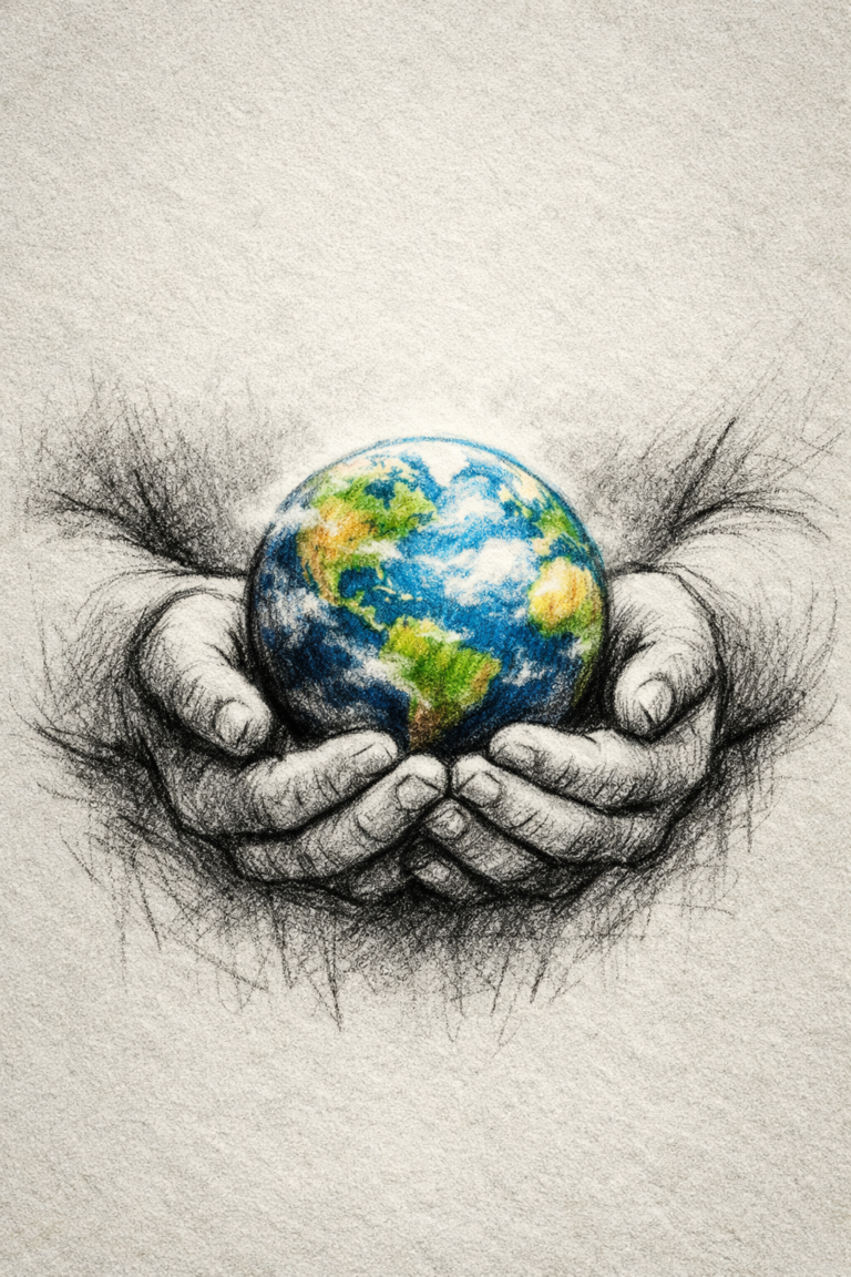
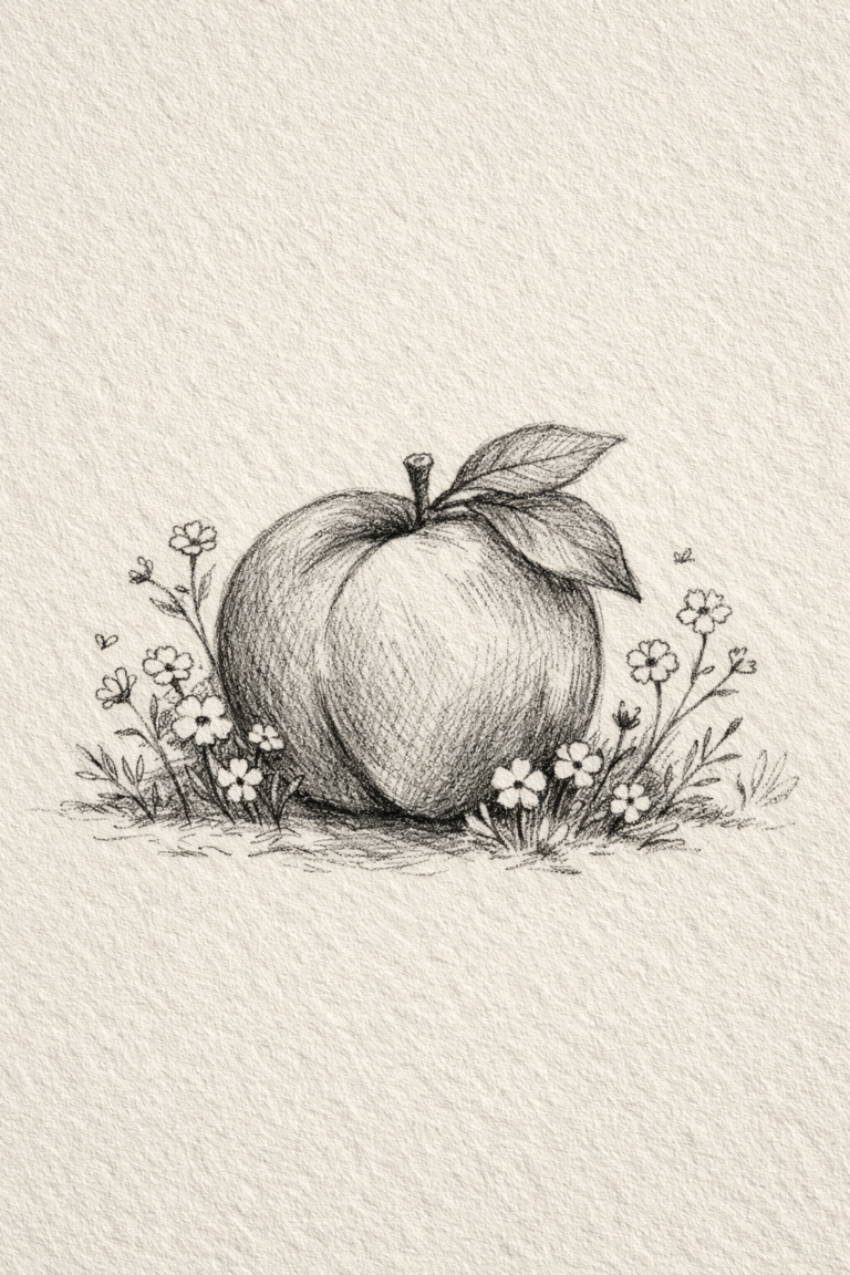
Creative Color Drawing Ideas
1
2
3
4
5
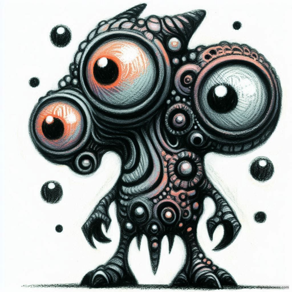
6
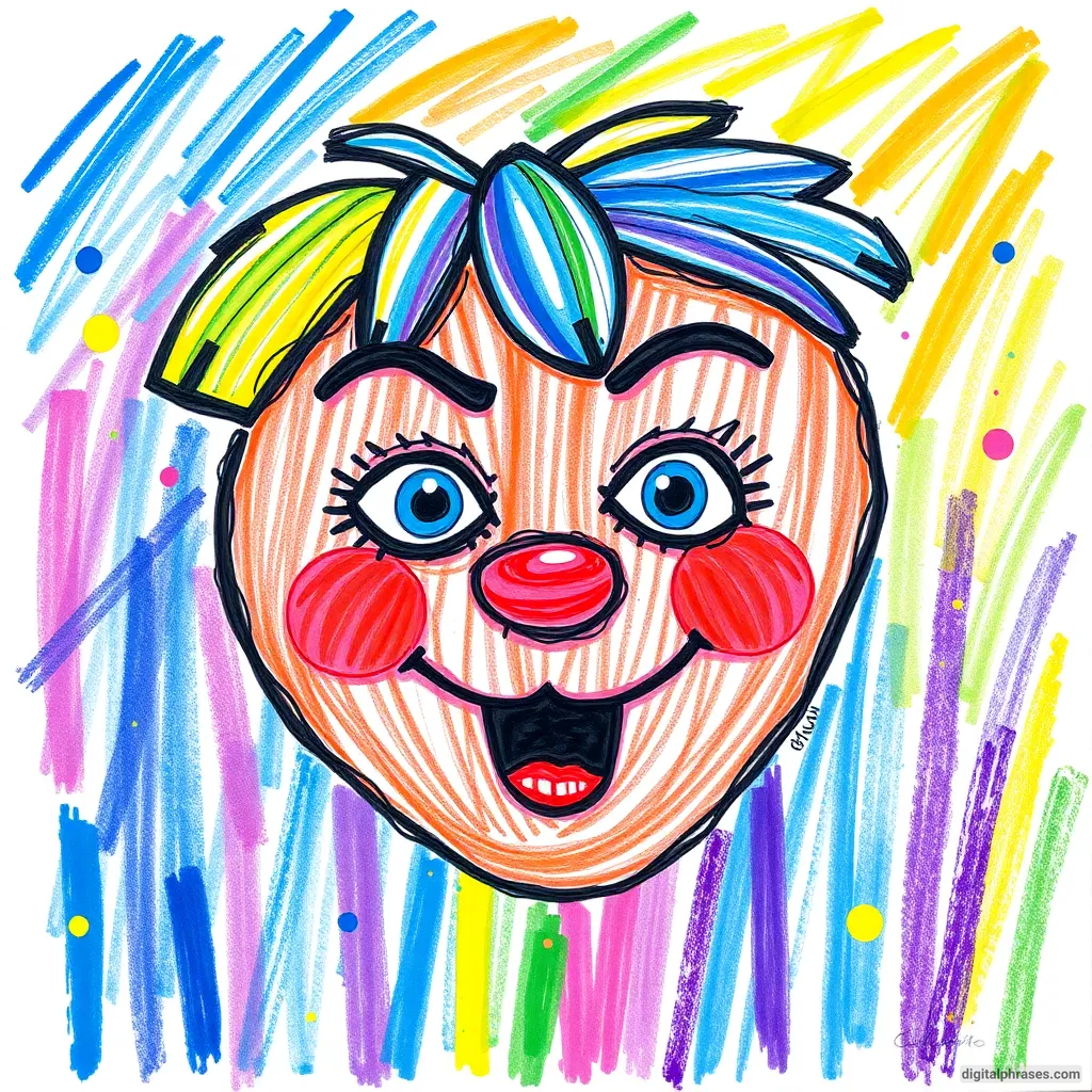
7

8
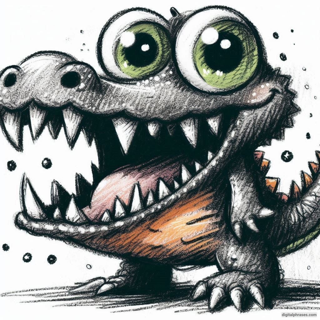
9
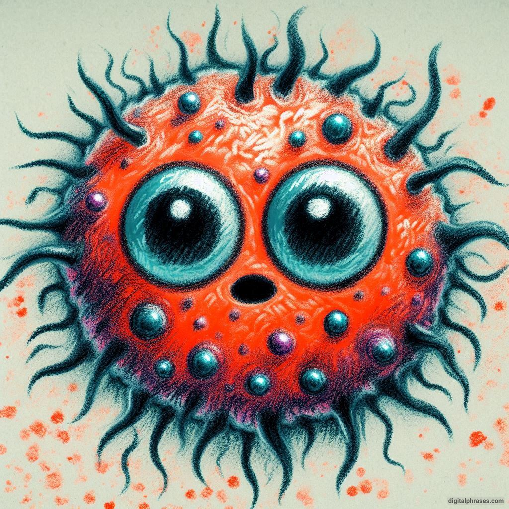
10
11
12
13
14
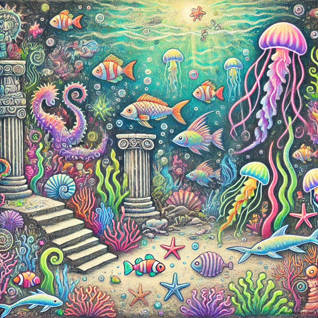
15
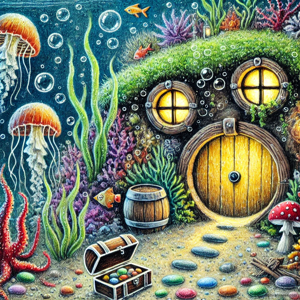
16
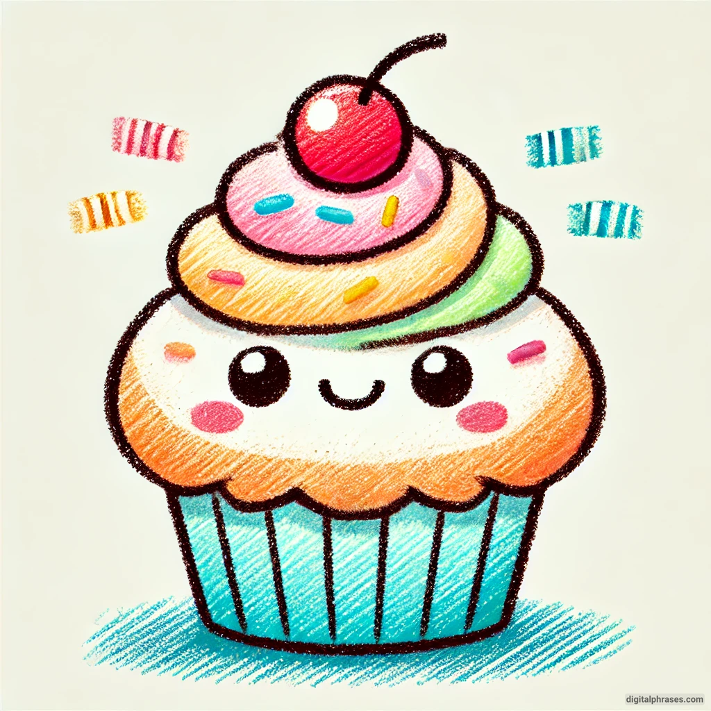
17
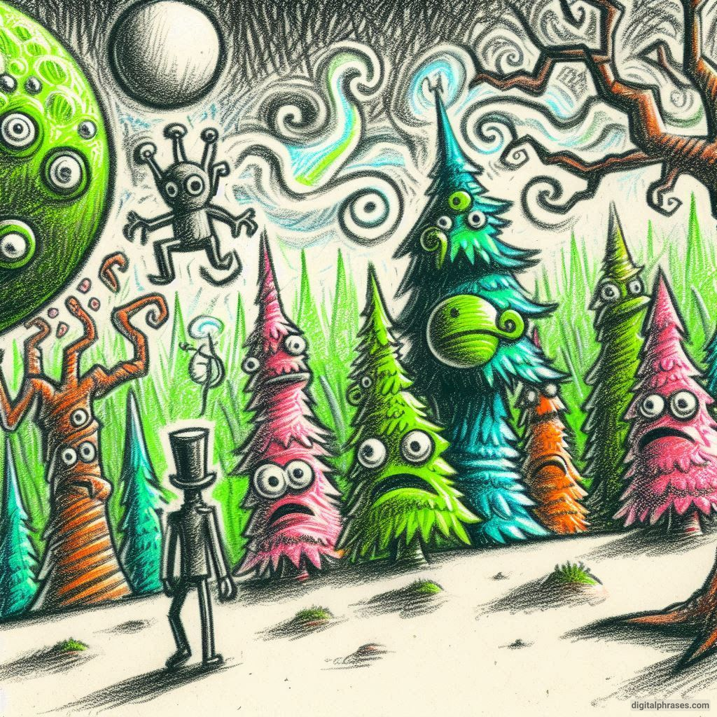
18
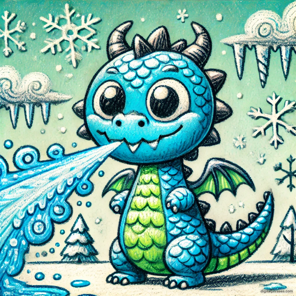
19
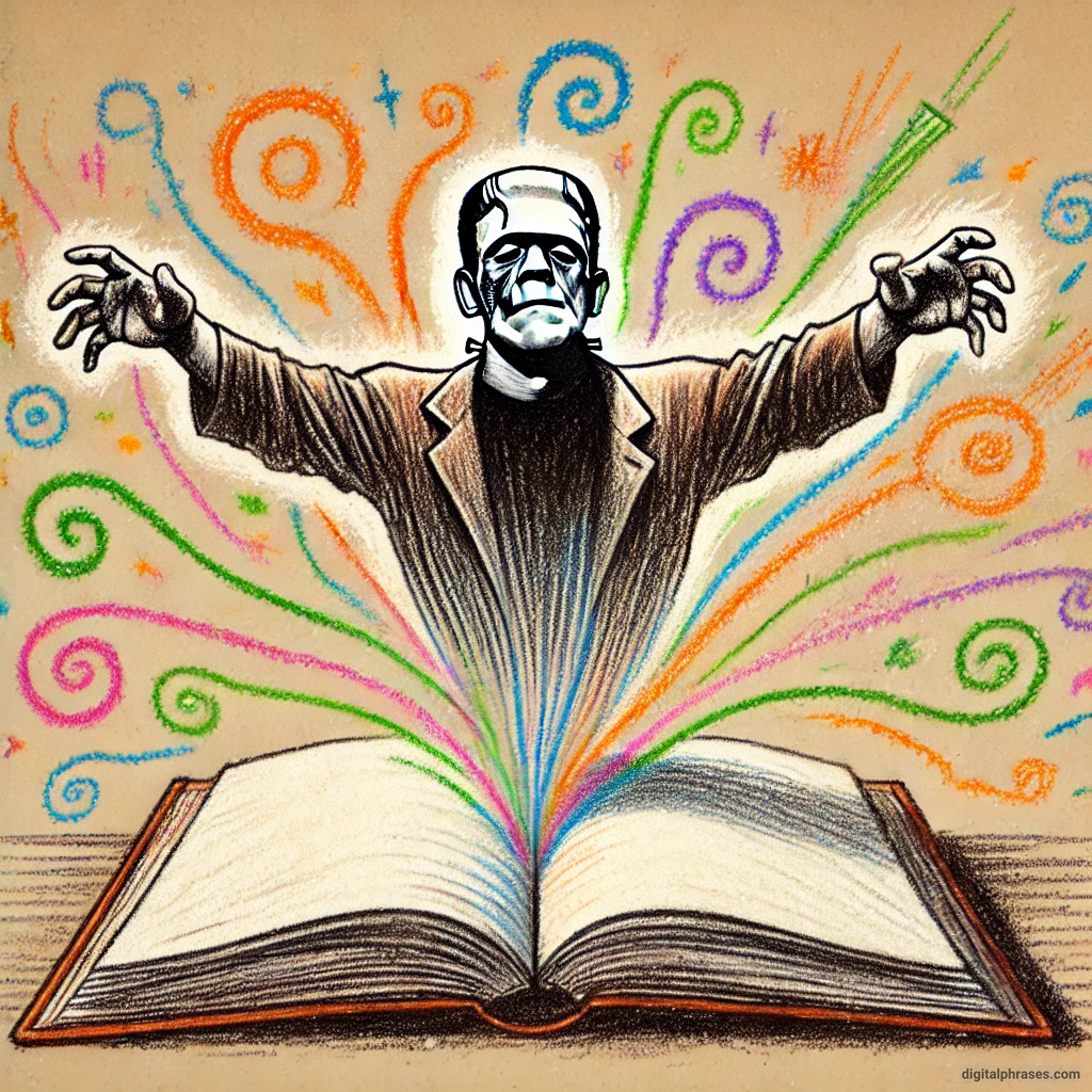
20
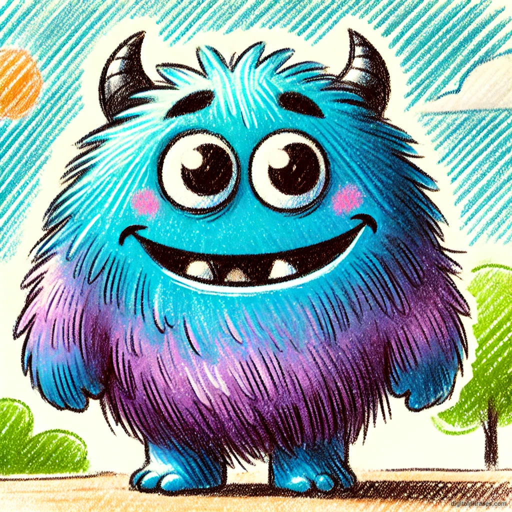
21
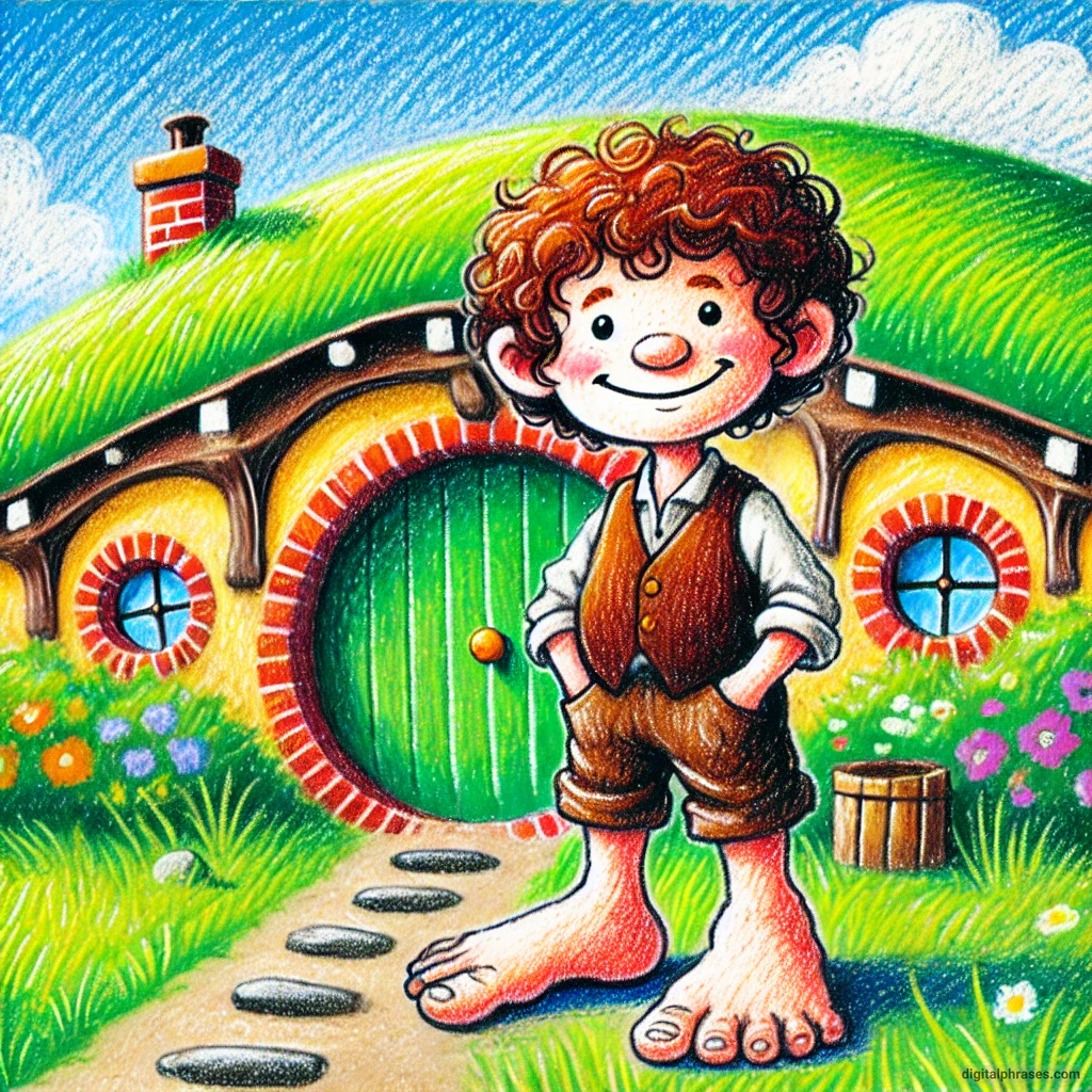
Things to Keep in Mind While Executing These Creative Color Drawings
1. Understand Color Theory
The foundation of any successful color drawing begins with a basic understanding of color theory.
Knowing how colors interact with one another is essential for making informed decisions about which hues to use, how to blend them, and how to create harmony or contrast within your artwork.
a. Primary, Secondary, and Tertiary Colors
At the most basic level, color theory starts with the primary colors: red, blue, and yellow. These are the fundamental building blocks of all other colors. By mixing primary colors, you can create secondary colors (orange, green, and purple).
Further mixing of these hues results in tertiary colors like red-orange or blue-green.
When working on a creative drawing, knowing how to mix colors effectively can help you achieve the specific tones and shades you need for your composition. This also allows for more nuanced color gradients and a broader range of possibilities when blending.
b. Complementary and Analogous Colors
In addition to knowing the basic types of colors, it’s important to understand how colors relate to one another on the color wheel.
- Complementary colors are colors that sit opposite each other on the wheel, such as red and green or blue and orange. Using complementary colors together can create strong contrasts that make certain elements of your drawing stand out.
- Analogous colors are next to each other on the color wheel, such as blue, blue-green, and green. These combinations can create a more harmonious and unified look, perfect for serene or natural scenes.
c. Warm and Cool Colors
Another aspect of color theory to consider is the difference between warm and cool colors.
Warm colors (reds, yellows, oranges) tend to evoke feelings of energy, warmth, and vibrancy, while cool colors (blues, greens, purples) are often associated with calmness, relaxation, and serenity.
Understanding this distinction can help set the mood for your creative drawing and enhance the emotional impact of your work.
2. Consider the Mood and Emotion
Color is not just a visual tool—it’s a psychological one as well. Different colors evoke different emotions, and being mindful of this can significantly affect the way your artwork is perceived.
a. Color Psychology
- Red: Passion, energy, anger, or love.
- Blue: Calm, sadness, or tranquility.
- Yellow: Happiness, optimism, or anxiety.
- Green: Growth, nature, or envy.
- Purple: Luxury, creativity, or mystery.
By choosing the appropriate colors, you can influence the emotional tone of your drawing.
For instance, if you are drawing a scene meant to evoke calmness, you might opt for a palette dominated by cool blues and greens. Conversely, a vibrant, energetic scene could lean more toward reds and oranges.
b. Personal Interpretation
While there are general guidelines in color psychology, it’s also essential to remember that color is subjective.
Different people may associate certain colors with different emotions based on their own experiences and cultural backgrounds. It’s important to use color in a way that feels authentic to your vision and to be open to varied interpretations of your work.
3. Create Balance with Contrast and Harmony
Creating balance within your drawing is crucial to ensuring that the viewer’s eye is drawn to the right areas and that the composition feels cohesive. This balance can be achieved by paying attention to contrast and harmony.
a. Contrast
Contrast can be achieved in various ways, one of the most important being through the use of color.
High-contrast drawings often involve the use of complementary colors or varying degrees of light and dark tones.
For example, placing a bright yellow object against a deep purple background will create an immediate focal point because the colors are so drastically different.
However, while contrast can make parts of your drawing pop, too much contrast can overwhelm the viewer. You may want to balance bold color choices with more subtle ones to keep the piece visually interesting without it becoming chaotic.
b. Harmony
Color harmony is achieved when colors are used in a way that is pleasing to the eye.
This doesn’t necessarily mean that your drawing has to be monotone or muted; rather, it’s about ensuring that the colors work together in a way that feels cohesive.
Analogous color schemes or the use of varying shades of the same hue can create a sense of unity within your artwork.
4. Experiment with Color Layering and Blending
One of the most exciting aspects of working with color in your drawings is the ability to layer and blend different shades to create depth, texture, and richness. This technique can take your drawings to the next level by adding dimension and complexity.
a. Layering
Layering involves applying multiple layers of color on top of one another. You might start with a light base color and then add progressively darker shades to build up the form and texture of the subject.
This technique is particularly effective in creating realistic effects, such as the folds of fabric or the subtle variations in skin tone.
b. Blending
Blending colors can create smooth transitions between hues, giving your drawing a polished and cohesive look.
You can blend colors using a variety of tools, such as blending stumps, cotton swabs, or even your fingers.
When blending, it’s important to use colors that transition well into one another; for example, blue and green blend more seamlessly than blue and red.
However, blending doesn’t always have to be smooth. You can experiment with rough, textural blending to achieve more expressive and abstract effects.
5. Use Color to Guide Composition
In any creative drawing, composition is key to directing the viewer’s eye and conveying your intended message. Color plays a significant role in guiding the composition and can be used strategically to lead the viewer through the artwork.
a. Focal Points
One way to guide composition with color is to use it to establish focal points.
A focal point is an area of the drawing that draws the most attention, and color can be an effective way to emphasize these areas.
By using a bold, bright color in a key part of your drawing, you can direct the viewer’s attention to that specific spot.
For instance, if your drawing features a sunset, you might use a bright orange or red for the sun while keeping the surrounding landscape in softer tones.
b. Color Flow
Another compositional strategy is to create a sense of flow through color. By repeating certain hues or gradually shifting from one color to another, you can lead the viewer’s eye through the composition in a way that feels natural and satisfying.
This technique is especially useful in more abstract or dynamic drawings where movement and rhythm are important.
6. Consider the Medium and Tools
The medium you choose can significantly affect how color behaves in your drawing. Whether you’re working with colored pencils, markers, pastels, or paint, it’s essential to understand the limitations and advantages of each tool.
a. Colored Pencils
Colored pencils offer great precision and control, making them ideal for detailed work. However, they can be more challenging to blend compared to softer media like pastels. When using colored pencils, layering is often the best approach to achieve rich, deep colors.
b. Markers
Markers provide vibrant, bold colors but can be difficult to blend due to their fast-drying nature. They’re great for creating sharp, clean lines and blocks of color, but they may require more planning to avoid streaks or overlapping marks.
c. Pastels
Pastels are soft and highly blendable, making them excellent for creating smooth transitions and soft edges. However, they can be messy to work with and require a delicate touch to avoid over-blending or smudging.
7. Trust Your Intuition and Experiment
While it’s important to understand the rules of color theory and composition, creativity often thrives when those rules are bent or broken.
Don’t be afraid to experiment with unexpected color combinations or unconventional techniques.
Trust your intuition as an artist, and allow yourself the freedom to play with color in ways that feel exciting and authentic to you.


