34 Color Drawing Ideas For Kids and Adults
You know how some people find peace in meditation, yoga, or sipping herbal tea while listening to soothing music?
Yeah, that’s not me.
I found my zen in the most unlikely place: color drawing.
And not in the “artsy” way where you create a masterpiece that belongs in a gallery. No, I’m talking about scribbling like a 5-year-old and somehow feeling like Picasso by the end of it.
Whether you’re a kid, a grown-up, or an adult pretending to have their life together (hello, that’s me), there’s something weirdly magical about grabbing a handful of colorful markers or crayons and just letting loose.
Forget rules and techniques—let’s embrace the chaos!
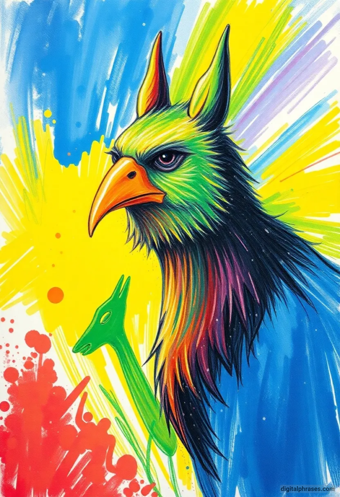
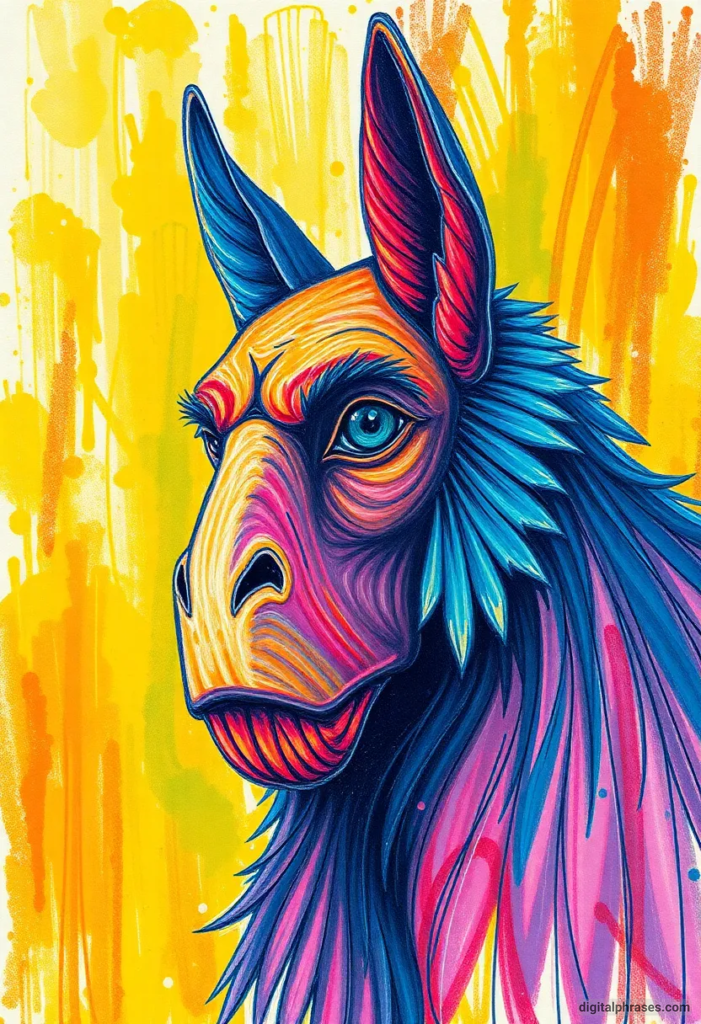
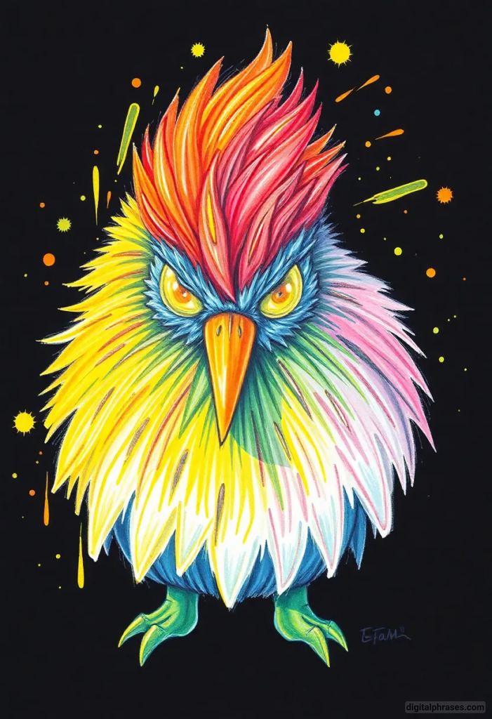
Color Drawing Ideas For Kids (Contains Both Simple and Difficult Ones)
1
2
3
4
5
6
7
8

9
10

11
12
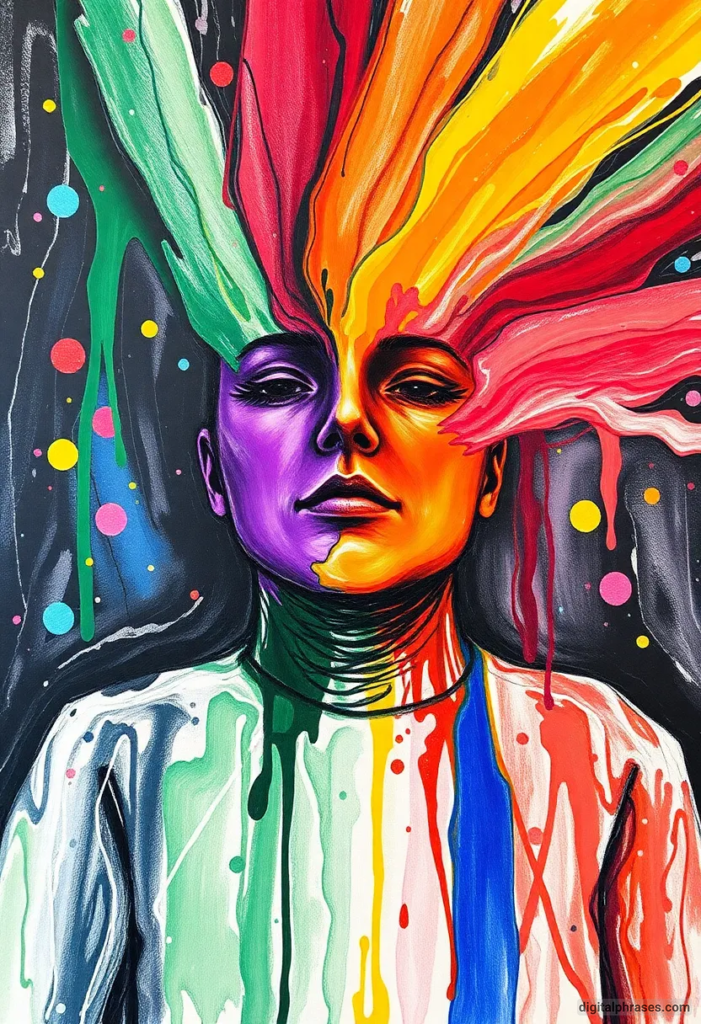
13
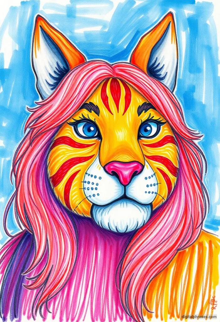
14
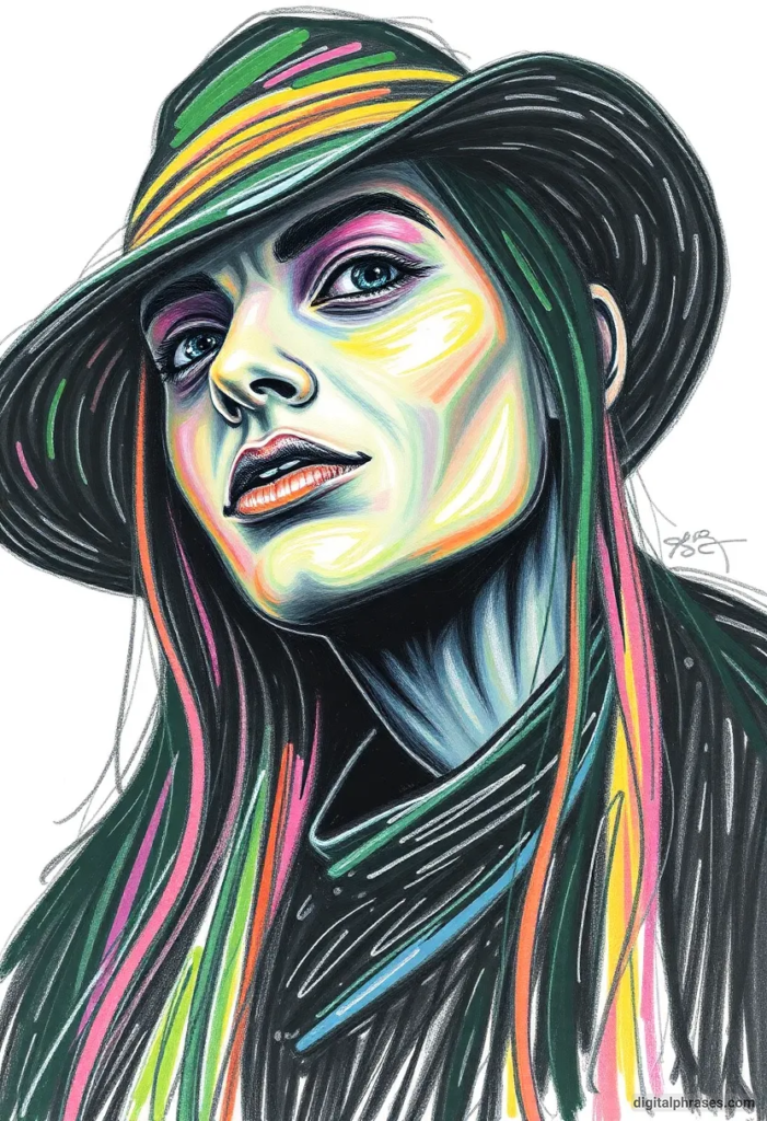
15
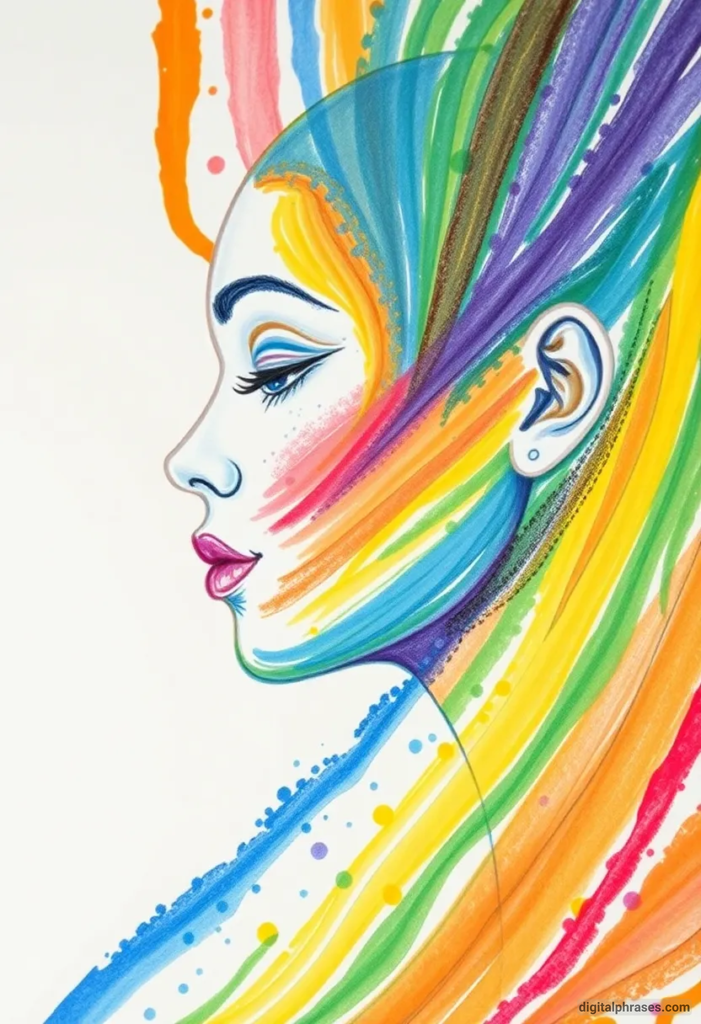
16
17

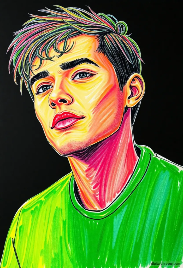
Color Drawing Ideas For Adults
18
19

20
21
22
23
24
25
26
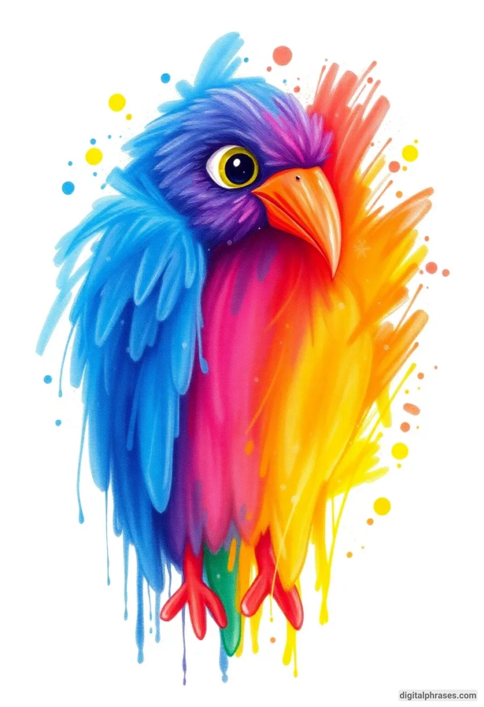
27

28

29

30
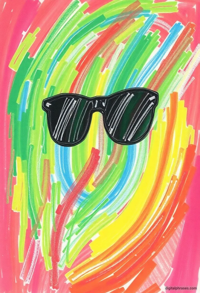
31

32
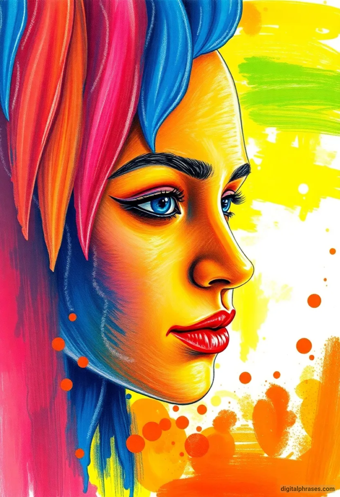
33
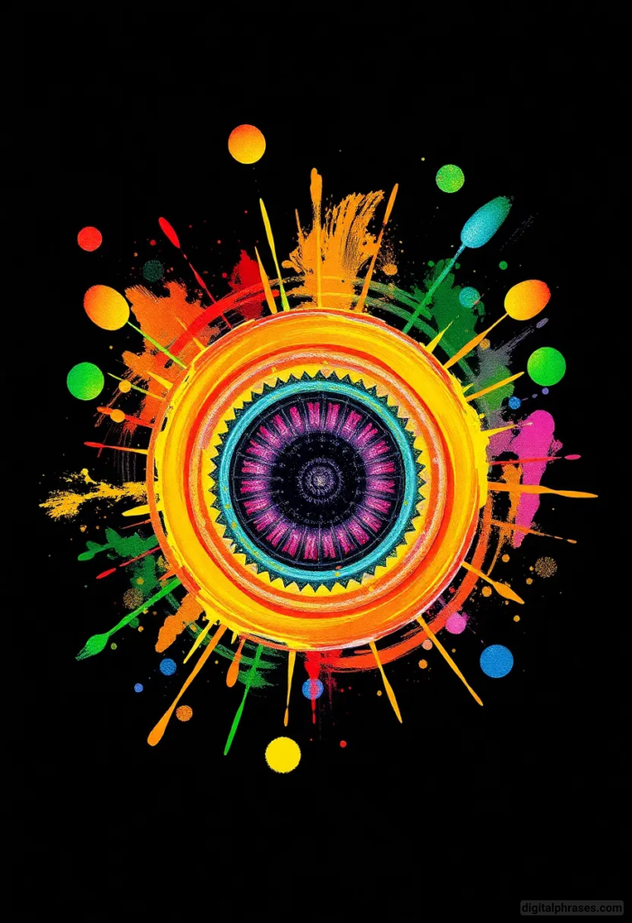
34

Things to Keep in Mind While Executing Color Drawings
1. Understand the Role of Color Theory
The first and foremost step in mastering color drawings is having a solid grasp of basic color theory. Color theory helps you understand how different colors interact with each other, which is essential in achieving harmony and contrast in your work. Here are a few key principles to remember:
- The Color Wheel: The color wheel is an essential tool for any artist. It helps in understanding primary, secondary, and tertiary colors. It also demonstrates relationships between colors, such as complementary (opposite), analogous (side-by-side), and triadic (evenly spaced).
- Warm vs. Cool Colors: Warm colors like red, orange, and yellow evoke feelings of energy, passion, and warmth. Cool colors like blue, green, and purple tend to convey calmness, tranquility, and peace. Knowing how to use these colors effectively can significantly enhance the mood of your artwork.
- Complementary Colors: These are pairs of colors that are opposite each other on the color wheel. When used together, they create a high contrast and can make each other stand out. For example, red and green, blue and orange, or purple and yellow can create vibrant effects when paired correctly.
- Monochromatic and Analogous Schemes: Monochromatic schemes use different shades and tints of one color, while analogous color schemes combine colors that are next to each other on the wheel, creating subtle and harmonious results.
Understanding these principles helps you avoid common pitfalls like muddying your colors or creating an unintentional jarring effect that doesn’t align with your artistic goals.
2. Choosing the Right Medium
When executing color drawings, the medium you choose is crucial, as each offers a unique texture, finish, and experience. Whether you use colored pencils, watercolors, markers, pastels, or digital tools, each has its strengths and limitations. Here’s what you should consider:
- Colored Pencils: These are perfect for fine details, layering, and blending. They offer great control and precision. However, creating large areas of even color with colored pencils can be time-consuming.
- Watercolors: Watercolors are fantastic for creating light, airy washes of color. They are ideal for landscapes, skies, and delicate effects. However, mastering control over watercolors can be tricky, as they can be unpredictable and require an understanding of water-to-paint ratio.
- Markers: Markers, particularly alcohol-based ones, provide vibrant, smooth layers of color. They’re great for quick drawings and achieving uniform fills, but blending colors can be a challenge unless you use specific blending techniques.
- Oil and Chalk Pastels: These are perfect for bold, textured effects. Pastels blend easily but can be messy, and they require a fixative to prevent smudging. They’re often used for expressive, impressionistic works.
- Digital Tools: If you’re creating digital color drawings, programs like Adobe Photoshop, Procreate, or Krita offer a vast range of possibilities. You can adjust colors easily, experiment with different brushes, and undo mistakes instantly. However, screen-based colors may not always translate perfectly to print, so be mindful of color profiles (such as RGB for screens and CMYK for printing).
Choosing the right medium depends on your personal preferences and the style of artwork you’re creating. Experimenting with different tools can help you discover the best one for each piece.
3. Plan Your Composition
Before jumping into adding color to your drawing, it’s essential to plan the composition of your artwork. This is especially important when working with colors, as unplanned application can result in an imbalanced or chaotic image. Here are some composition tips:
- Focus on the Focal Point: Decide where you want the viewer’s attention to be. Your use of color can guide the eye towards or away from certain areas of the drawing. For example, placing a bright, bold color on your focal point will attract attention, while using neutral or softer tones around it can help frame it.
- Balance: Balance in a composition refers to the distribution of visual weight in an artwork. You can achieve balance through the arrangement of color, value (light and dark areas), and the placement of elements. Symmetry can create formal balance, while asymmetry can create a dynamic and energetic feel.
- Color Flow: Consider how the colors move throughout your composition. Are they leading the eye in a particular direction? Do they help create a sense of movement or narrative? Avoid placing too many intense colors in one area, as it can overwhelm the viewer.
- Negative Space: Don’t forget about the importance of negative space (the empty areas around the subject). White or neutral-colored spaces can give the eye a place to rest and emphasize your main subject more effectively.
Planning the composition will help you make conscious choices about where and how you apply your colors, which in turn will give your artwork a cohesive and deliberate feel.
4. Use Layers and Build Gradually
Color drawings are often created in layers, especially if you’re using media like colored pencils, watercolors, or pastels. Building up colors gradually gives you more control over the final result and prevents you from making irreversible mistakes. Here are a few strategies:
- Light to Dark: A common rule of thumb when layering colors is to start with lighter tones and gradually build up to darker ones. This allows you to establish the basic structure of your colors and make adjustments as you go. For example, in colored pencil drawings, laying down a light base color and then slowly adding darker shades can create depth and realism.
- Blending Techniques: Blending is crucial to achieving smooth transitions between colors. Depending on the medium, you can blend using a variety of methods. With colored pencils, you can blend by applying pressure or using a blending pencil or solvent. With pastels, you can use your fingers or a blending tool to smooth colors together.
- Don’t Rush: Take your time to build up your layers. Rushing can lead to uneven applications, unwanted smudges, or muddy colors. Let each layer dry or set before applying the next one, especially with watercolors or markers, to prevent bleeding or unwanted color mixing.
5. Mind the Lighting and Shading
Lighting plays a significant role in how your colors are perceived and how realistic or three-dimensional your drawing will appear. Understanding where the light source is and how it affects the colors and shadows in your drawing is key.
- Highlights: These are the areas where light hits the surface most directly. Use lighter colors or even leave areas of your paper untouched to create highlights. In some cases, a white gel pen can be used to add fine highlights at the end.
- Shadows: Shadows give depth and form to your drawing. Use darker, desaturated versions of your base colors to create shadows. Be cautious about using straight black for shadows, as this can look harsh. Instead, experiment with complementary or analogous dark tones to achieve a more natural look.
- Reflected Light: Don’t forget about reflected light in shadows. In real life, shadows are rarely just one solid color. Light bounces off surrounding surfaces and influences the color of the shadowed areas. This can add a realistic and complex effect to your artwork.
Mastering lighting and shading will make your drawings more dynamic and help create the illusion of depth and volume.
6. Practice Patience and Experimentation
Art is as much about the process as it is about the final product. When creating color drawings, patience is essential, particularly when learning new techniques or experimenting with new tools. Allow yourself to make mistakes and learn from them. Here are some ideas for how to embrace experimentation:
- Try Color Swatches: Before committing to a color in your drawing, try out color swatches on a separate piece of paper. This will help you see how the colors interact with each other and whether they achieve the desired effect.
- Experiment with Color Schemes: Try out different color schemes, even if they seem unconventional at first. Sometimes unexpected combinations can yield the most striking results.
- Play with Texture: Experiment with adding texture through your medium. For example, you can create rough textures with dry-brushing techniques in watercolor or cross-hatching with colored pencils.
- Be Flexible: Sometimes a piece doesn’t turn out exactly how you envisioned it—and that’s okay! Be flexible with your process, and know that every drawing, even those that don’t meet your expectations, is a learning experience.


