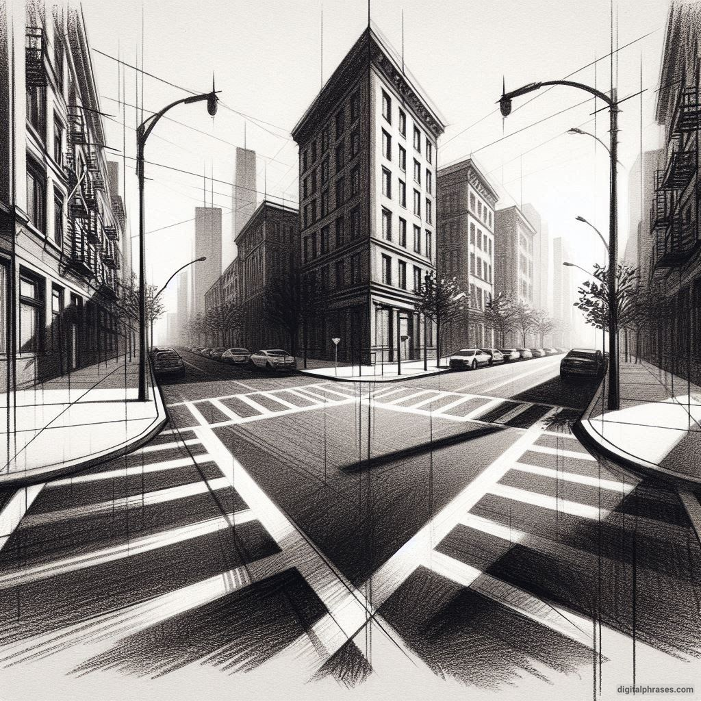
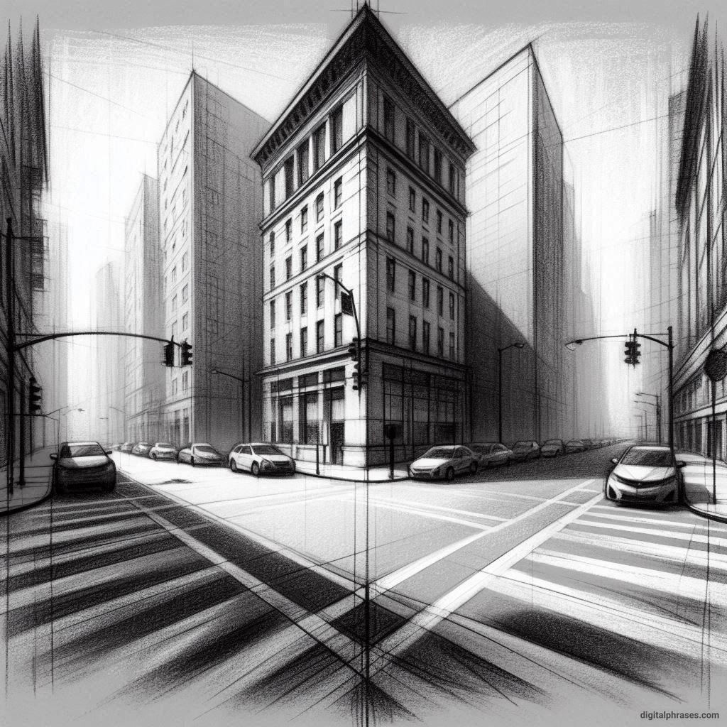
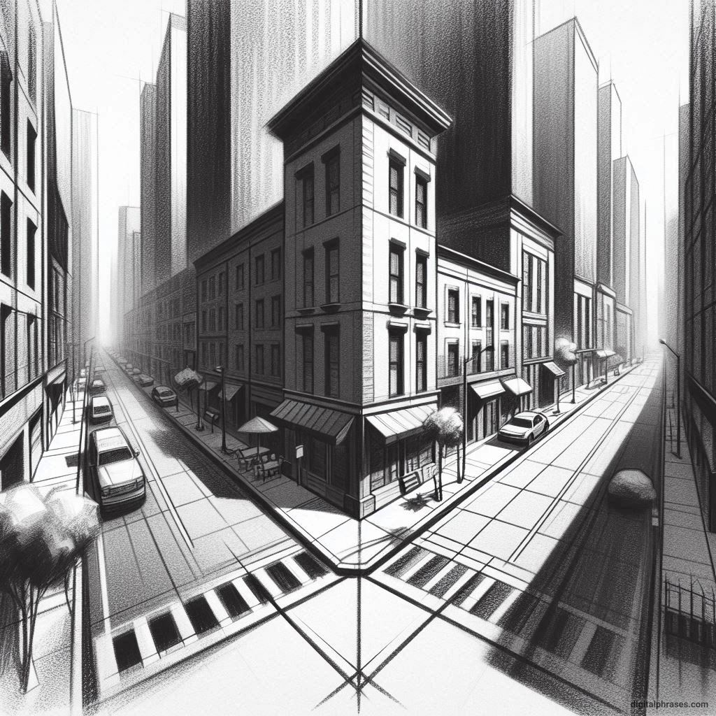
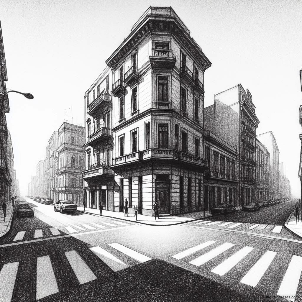
21 Two Point Perspective Drawing Ideas of a City
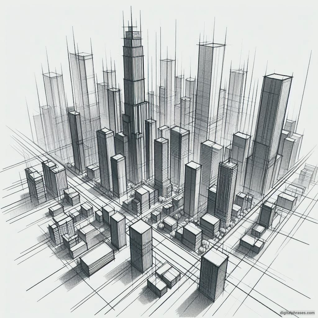
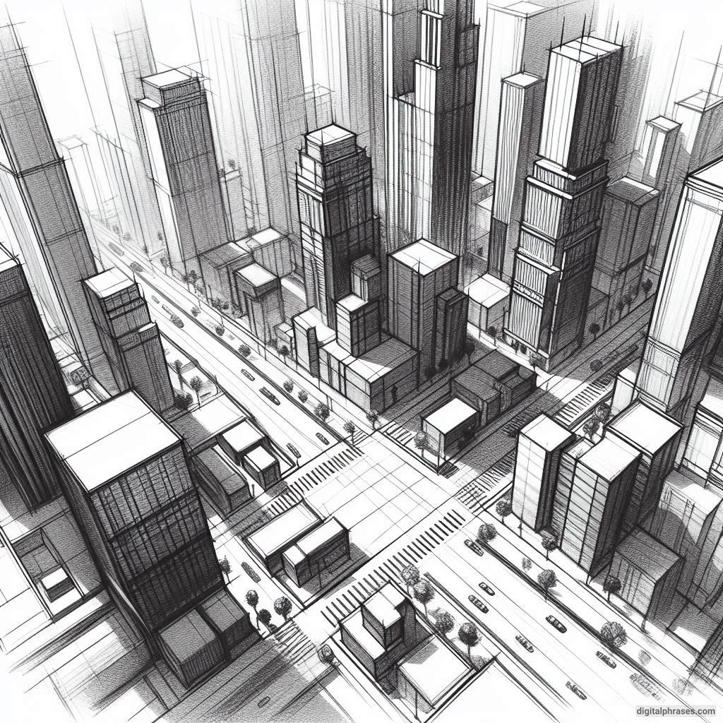
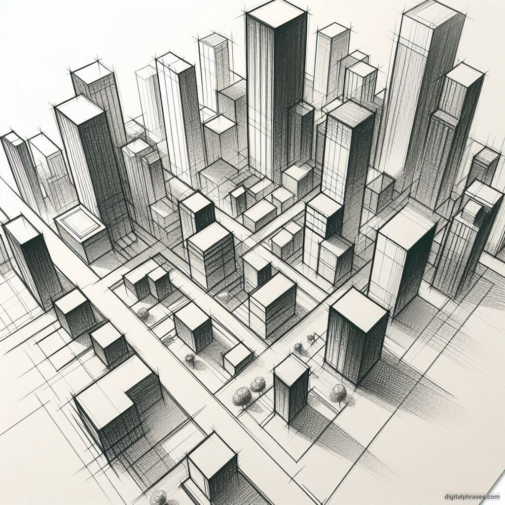
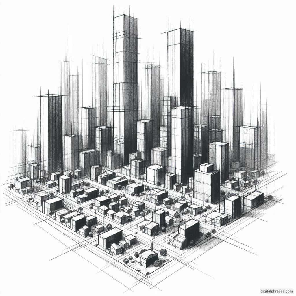
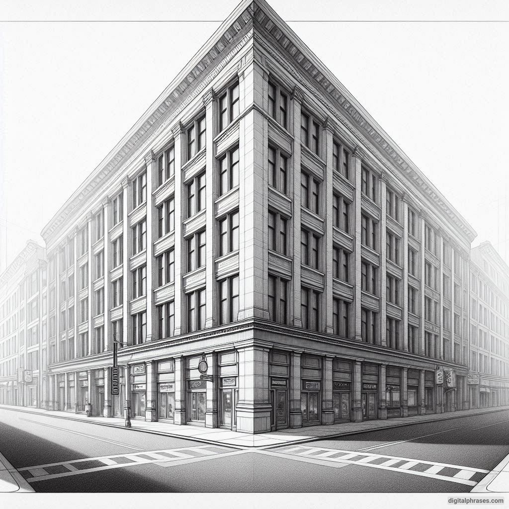
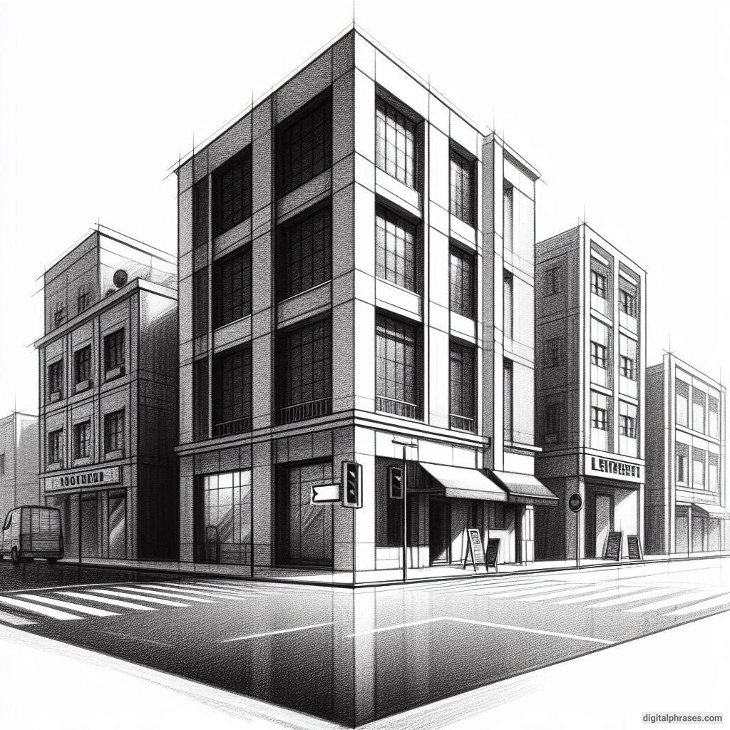
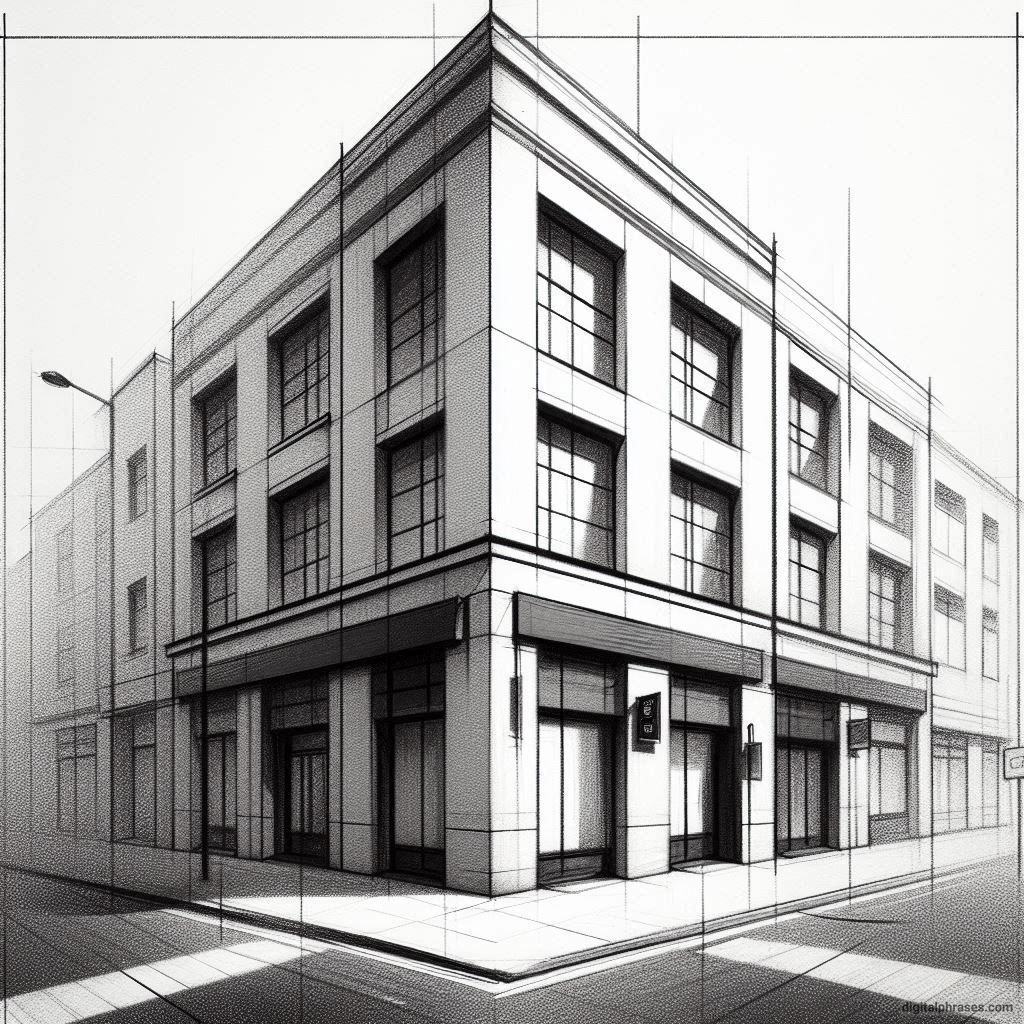
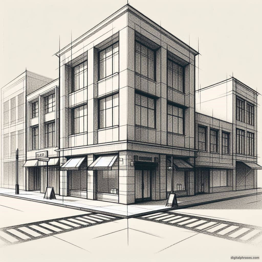
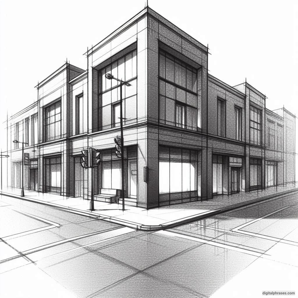
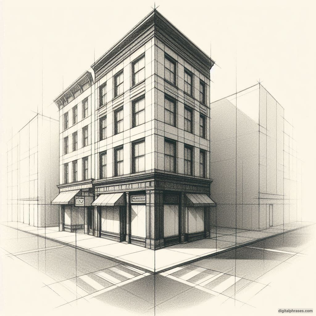
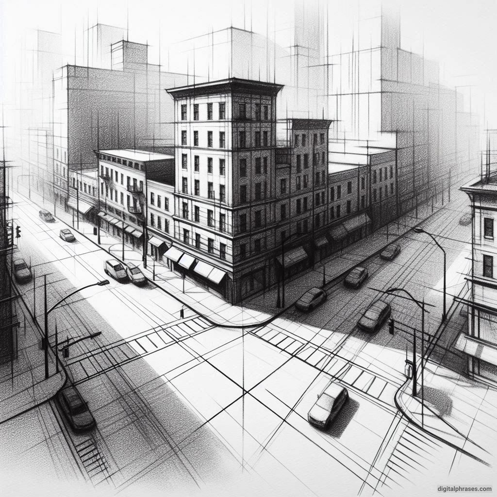
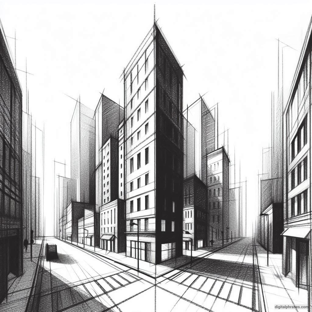
Two-point perspective is the secret sauce for turning those wibbly-wobbly skyscrapers into something that might actually pass for… well, skyscrapers.
The trick is using not one, but two points on the horizon line to give your buildings that crisp, dramatic edge, like they just walked out of an architectural magazine.
So, grab your pencils, rulers, and maybe some caffeine (because, trust me, this can get intense), and let’s dive into some fun cityscape drawing ideas that’ll make you feel like the next big urban planner—or at least not like a doodling disaster.
You ready?
Let’s draw some buildings that don’t look like they’re on the verge of collapse!
Two-Point Perspective Drawing Ideas of a City
1
2
3
4
5
6
7
8
9
10
11
12
13
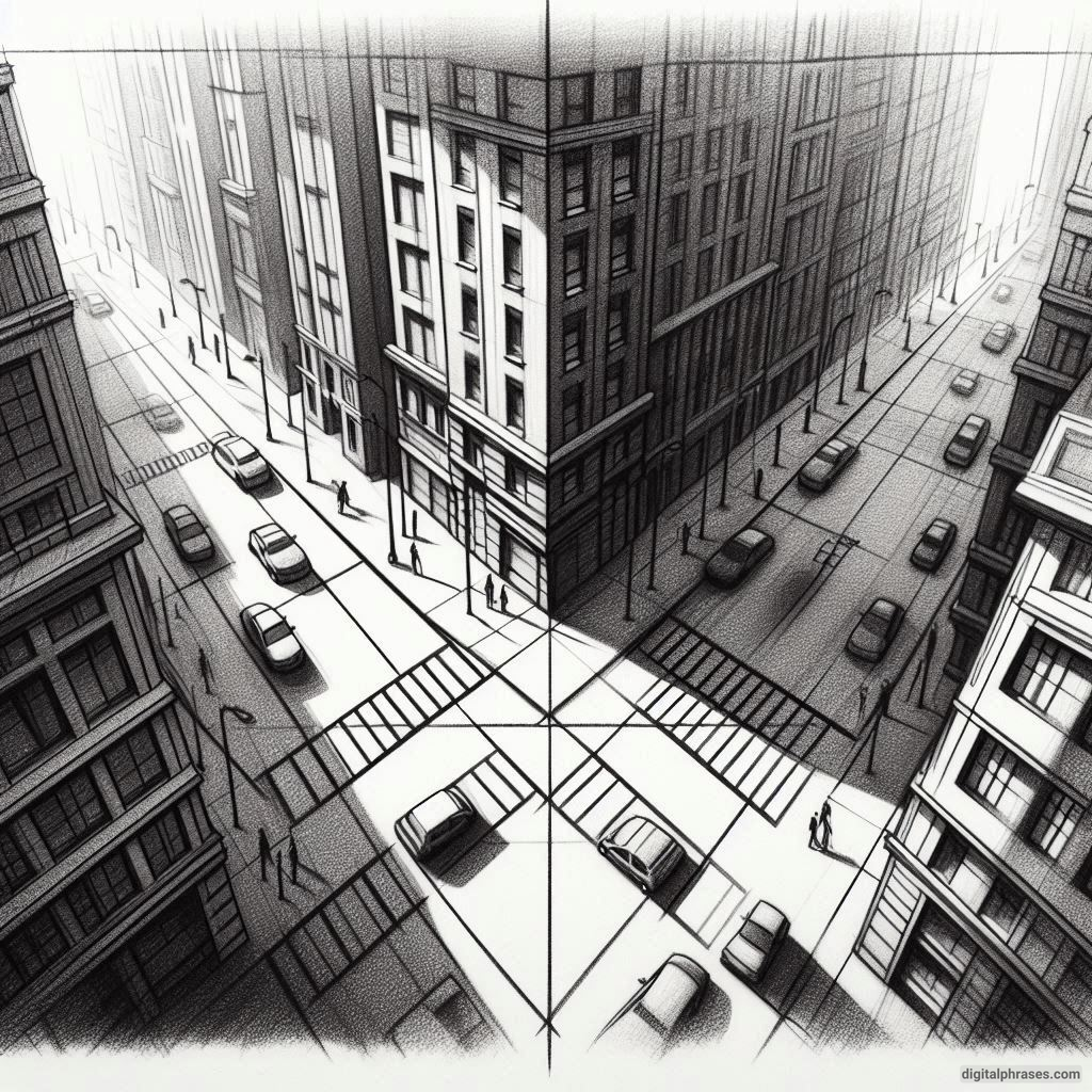
14
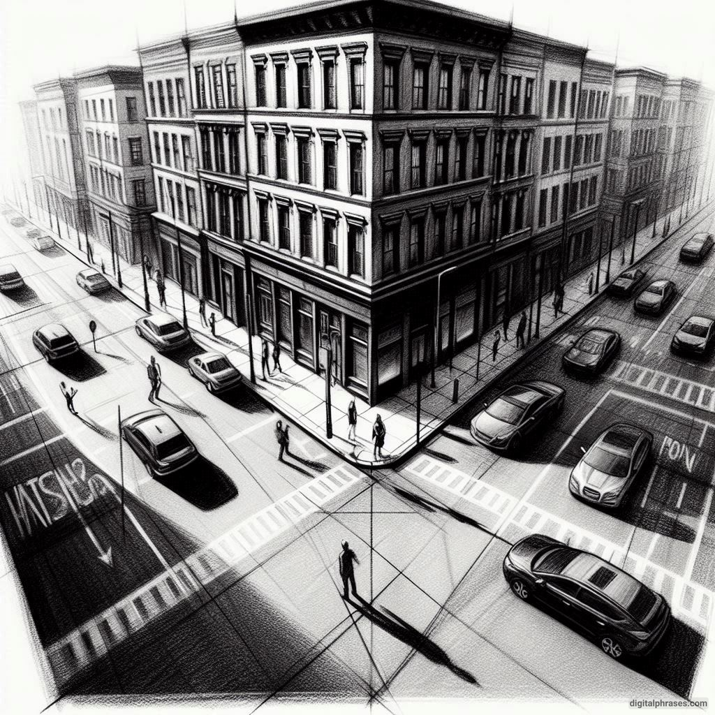
15
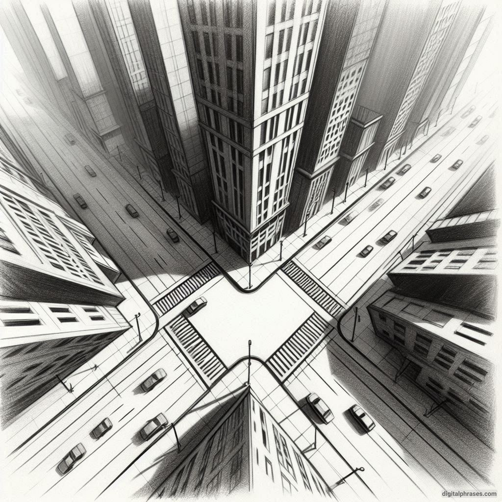
16
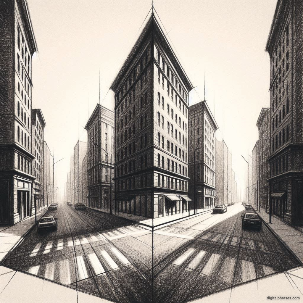
17
18
19
20
21
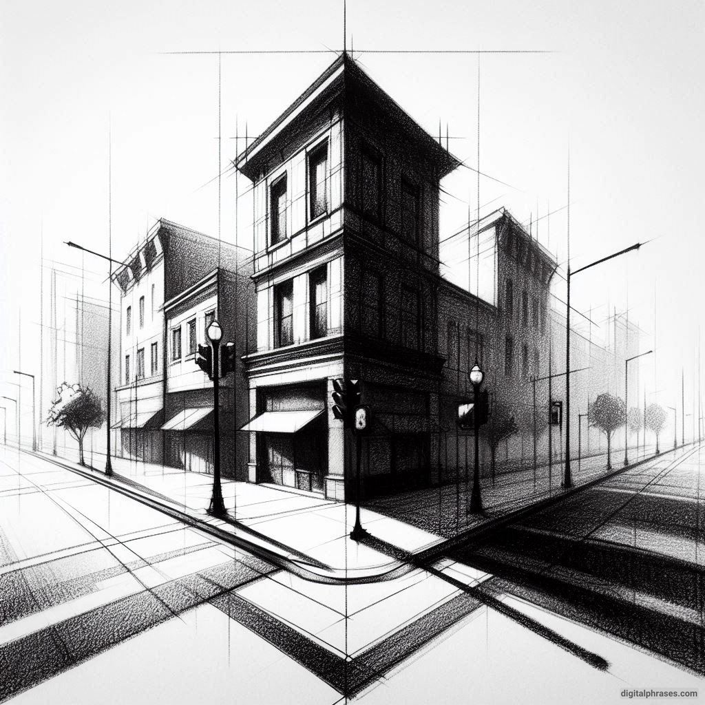
Tips and Tricks for Two-Point Perspective City Drawings
1. Embrace the Mighty Vanishing Points (Yes, You Need Two)
First things first: vanishing points. Two-point perspective means you’ll need two of them. They’re the foundation, the backbone, the “ancient ancestors” of your drawing.
Without these points, you’re not drawing in two-point perspective; you’re just making lines go wherever they please. So, let’s rein them in.
Think of these points as the stars of the show. You’ll place one vanishing point way off to the left and the other far, far to the right. The further apart they are, the more realistic and “city-like” your drawing will appear. But beware!
If you place them too close together, you’ll get a very weird “squished” city that feels like it’s trying to fold in on itself, like it’s in a black hole or some other interdimensional mishap.
Tip: Put those vanishing points way off the edges of your paper. I mean, waaay off. Like, across the room. (Just kidding, but seriously—further apart = better.)
2. Lines, Lines, and More Lines
Okay, with your vanishing points sorted, it’s time to embrace what I lovingly call “The Line Parade.” Here’s where you’ll be drawing construction lines from all corners of your buildings toward those two vanishing points. You’ll feel like a spider spinning its web… only more chaotic.
These lines will dictate the angle of everything: rooftops, sidewalks, even that tiny streetlamp no one cares about but somehow takes 10 minutes to get right.
Every single line has to obey the two-point perspective gods. You might feel rebellious and try to draw a line that doesn’t follow the vanishing points. Don’t. I learned this the hard way, and the result looked like a city designed by a toddler who discovered a ruler for the first time.
Pro Tip: Use a ruler. Trust me, freehand lines in two-point perspective are a fast track to Slant City.
3. The Horizon Line
Ah, the horizon line. It’s not just a line; it’s a lifestyle. In two-point perspective, this line represents the viewer’s eye level.
Everything above it will angle downward to the vanishing points, and everything below it will angle upward. So, basically, the horizon line is like that strict teacher who tells you where you can and can’t go.
Place the horizon line high for a bird’s-eye view or low for a street-level look. Be intentional here.
When I first started, I’d slap that line wherever and end up with bizarre-looking cities.
One moment, I was an ant staring up at skyscrapers; the next, I was a drone buzzing over the city. Moral of the story? Be mindful of where you put this line, because it controls your whole drawing’s vibe.
4. Layering Buildings
Once you’ve got your lines and vanishing points sorted, you’ll want to start adding buildings. Here’s where it gets tricky because layering these suckers in a way that doesn’t make your brain hurt is easier said than done.
Start with the buildings closest to the foreground. Draw one main building first, then add the ones in the background, making sure they recede toward your vanishing points. Keep track of which building sits in front of which, or you’ll end up with a Frankenstein’s city where buildings intersect in places they shouldn’t.
This part is also where you’ll learn the true meaning of patience. Drawing cityscapes in two-point perspective can quickly devolve into a guessing game of “Is this line behind or in front of that one?” So remember, slow and steady. You’re not racing against the clock; you’re racing against your patience.
5. Details!
Alright, so you’ve got your city structure—now it’s time for the details. Here’s where you can bring your city to life with windows, doors, signs, streetlights, or even the occasional cat on a rooftop. But let me be real with you: details can ruin everything if you go too wild.
Follow your vanishing points, even for tiny details like windows or bricks. I once drew a building covered in lopsided windows, and it looked like something out of a surrealist nightmare. Tiny windows need perspective love too!
Also, don’t stress about making every detail absolutely perfect. You’re drawing a cityscape, not applying for a position at Architectural Digest. Let a few imperfections happen, and your city will look more alive (and less like you’ve spent your entire life perfecting the lines on a single window).
6. Light and Shadow
Congratulations! You’ve got buildings with lines that aren’t revolting, you’ve added some delightful windows, and things are starting to look… decent. But now, let’s add a bit of flair. Because every good drawing needs shadows and light, right?
Figure out where your “sun” (or main light source) is coming from, and add shadows accordingly. This can make your city feel real and help you avoid that cardboard cutout look. Shadows give depth, personality, and drama. Picture your buildings leaning, casting long, sinister shadows over the street below—it’s like your city has an attitude.
Just don’t overdo it. Too many shadows, and it’ll look like a zombie apocalypse just hit. Not enough shadows, and everything feels flat and uninspired. Try a little shadow here, a little light there, and watch your city transform.
7. Remember to Take Breaks
Listen, two-point perspective cityscapes aren’t for the faint-hearted. You’re going to mess up. You’ll misplace a vanishing point, smudge lines, and maybe even consider burning your sketchpad. Take breaks. Drink water. Stretch. Look out a window at a real city (and marvel at the lack of vanishing points you have to worry about out there).
Honestly, I’ve found that some of my best “Aha!” moments come after stepping away for a bit. Give yourself a breather, then come back with fresh eyes. Your drawing (and your mind) will thank you.
8. The Final Touch – Don’t Overthink It!
Finally, know when to call it done. There’s always that temptation to add “just one more line” or “just one more window.” I’ve been there, and let me tell you—it’s a rabbit hole. You could keep tweaking forever, but at some point, you have to step back and say, “Alright, this is a city.”
Remember, cities in real life aren’t perfect, and your drawing doesn’t have to be either.
That slightly crooked window? It adds character. The off-center door? Maybe the architect was just having a bad day.
Embrace the imperfections.


🙂 Love the ideas
thanks